Fairways Ridge
Longmont, CO
Situating living and work within an expansive natural setting
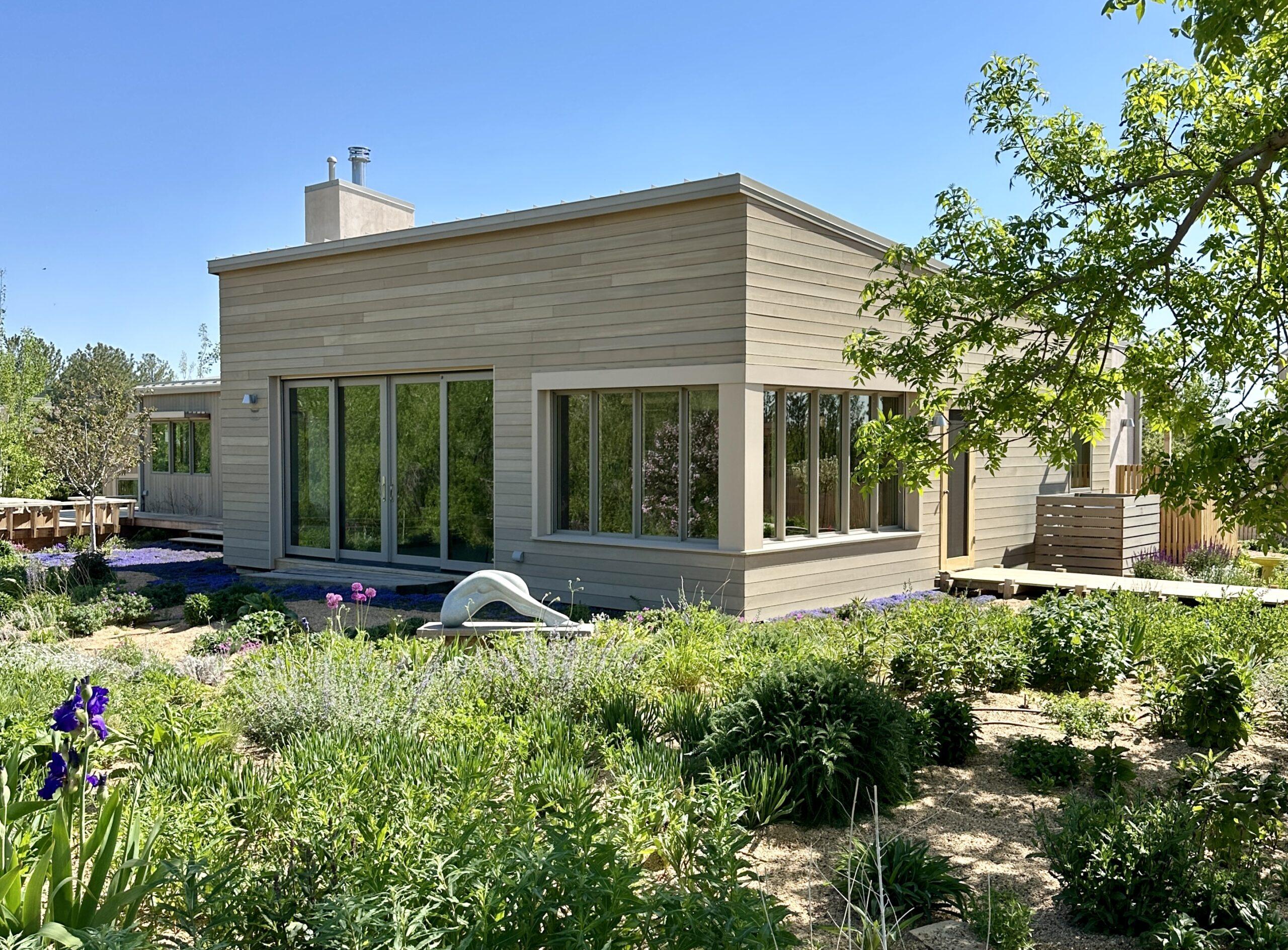
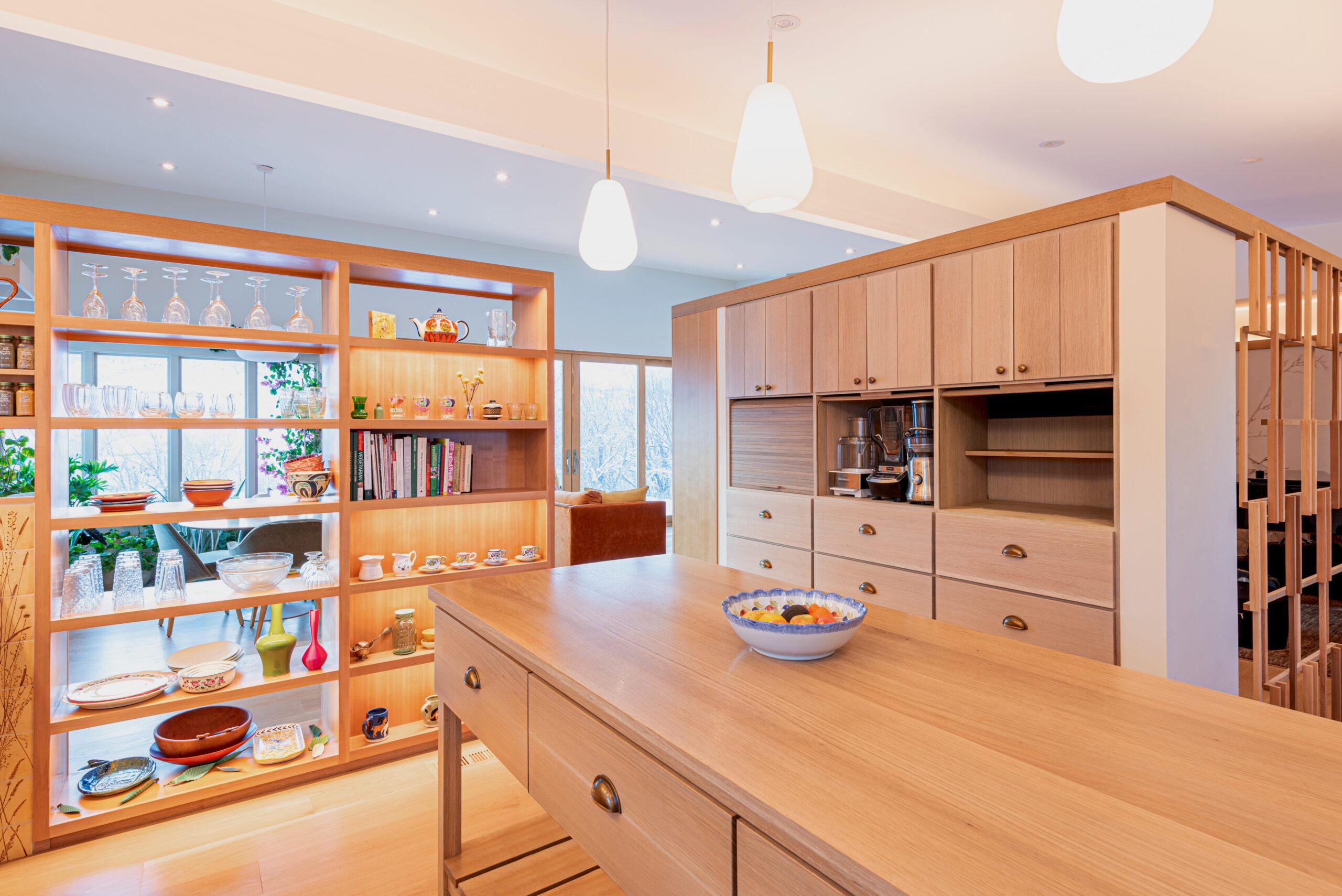
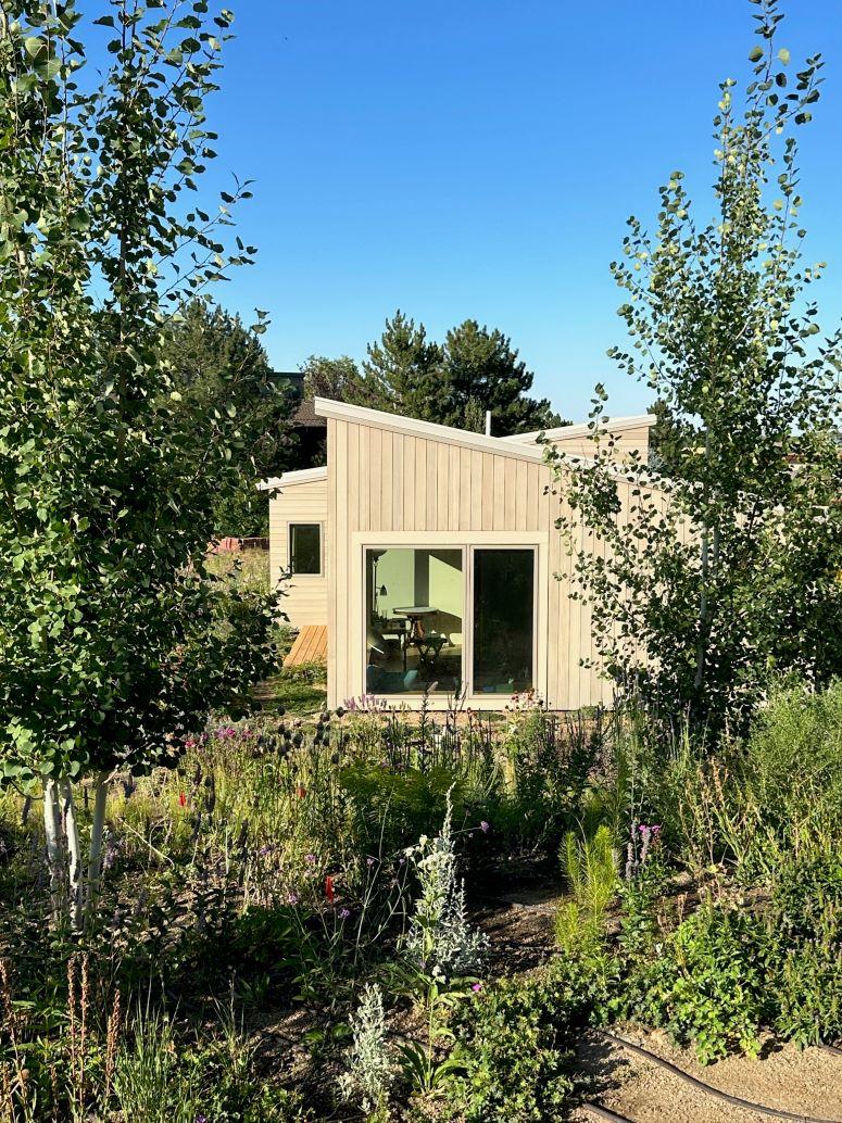
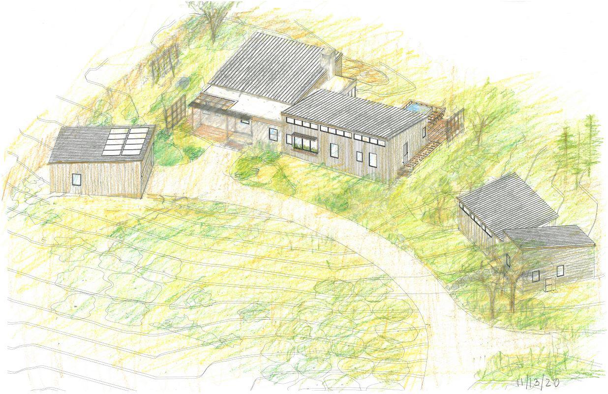
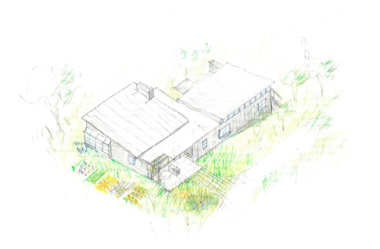
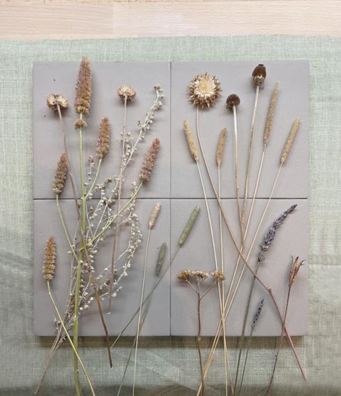
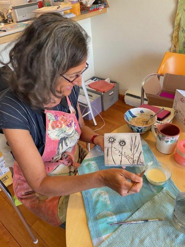
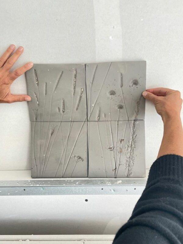
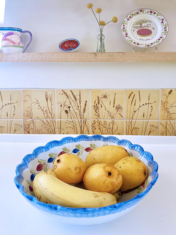
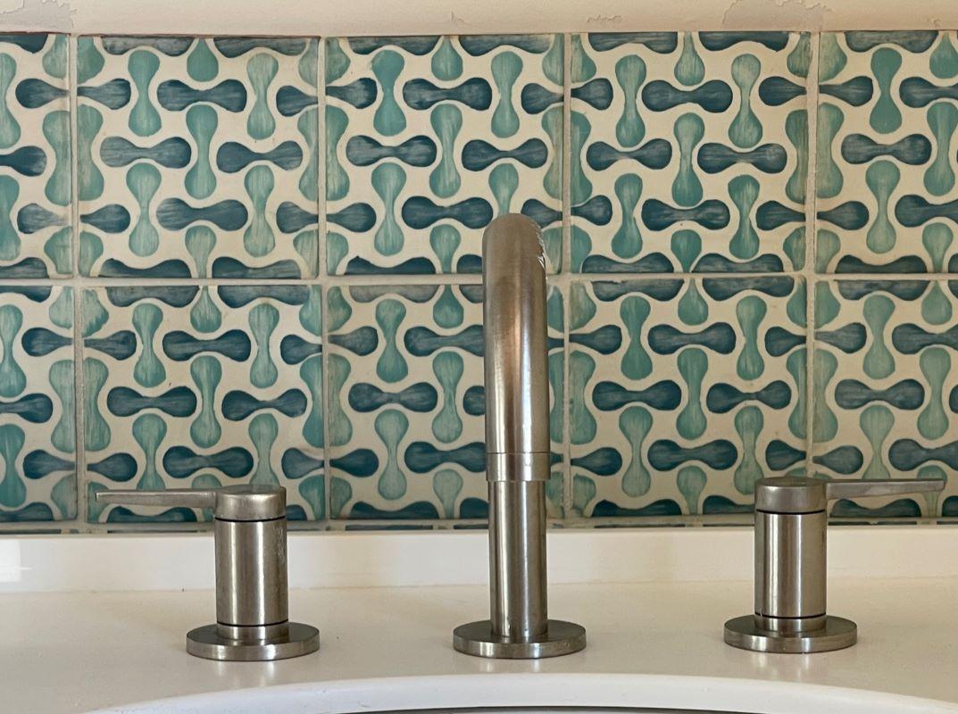
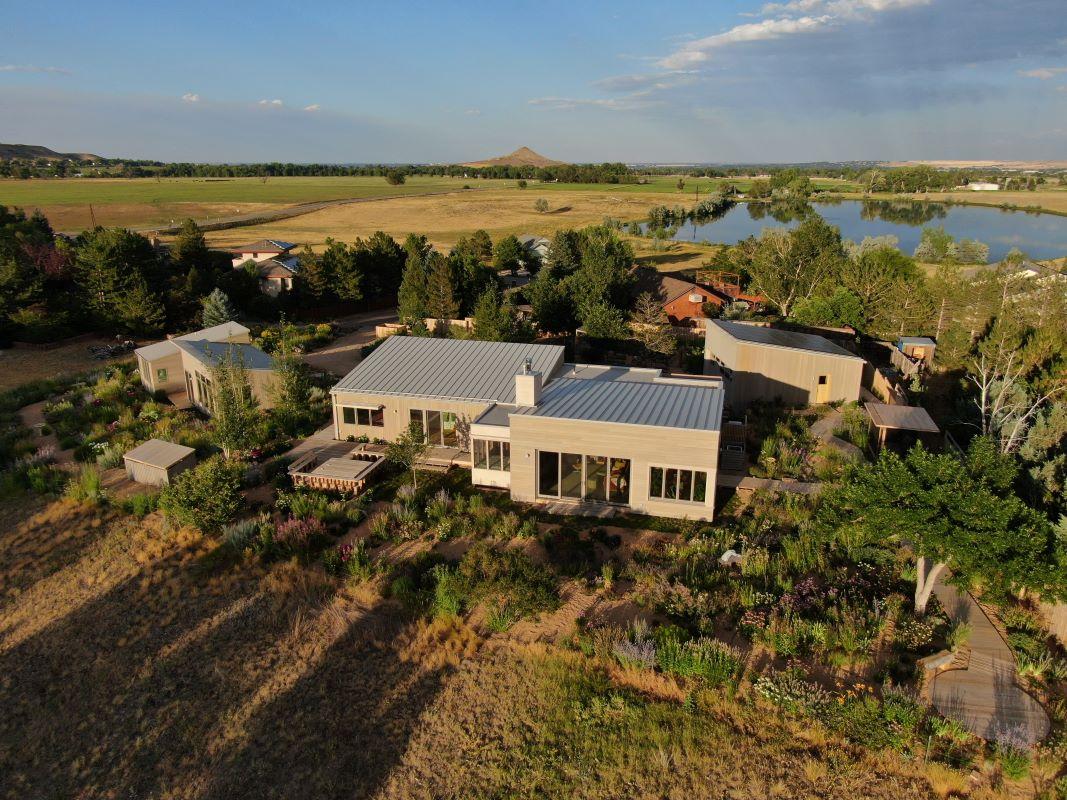
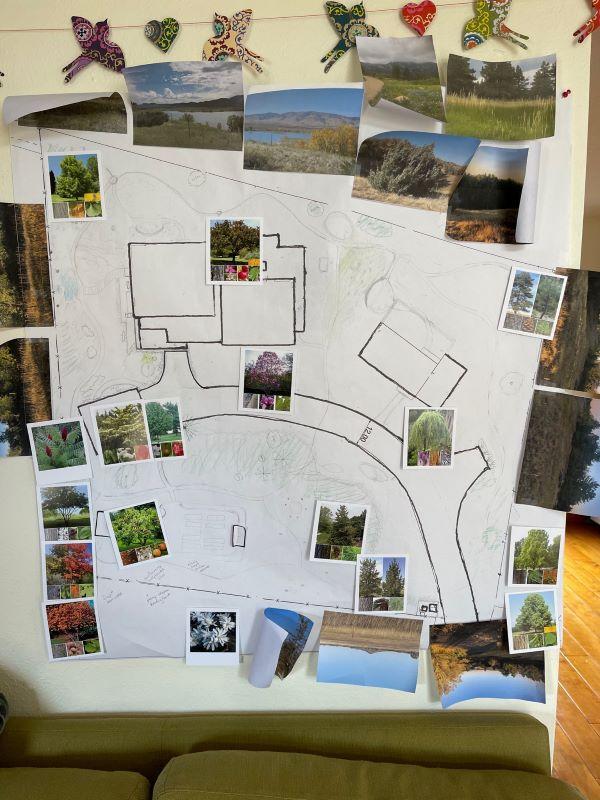
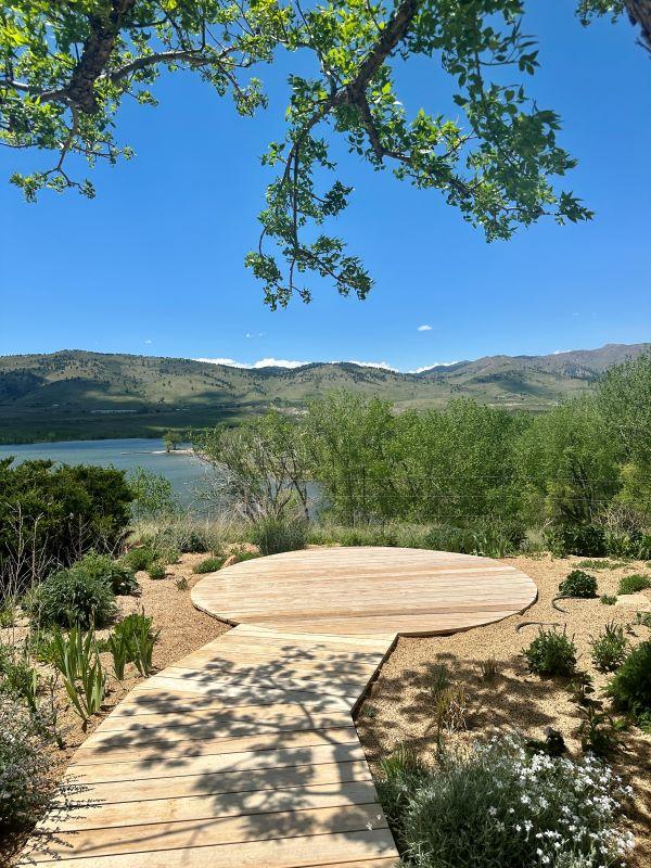
Overlooking the Lefthand Reservoir in the Rocky Mountain region of Colorado, the design for Fairways Ridge uses anti-monumental techniques to create an authentic and playful living space. The new house is constructed on the foundations of a previously existing one, an approach that supported economic and sustainable practices while necessitating a disciplined attention to scale. The clients for Fairways Ridge, Eve Pollak and Kate Mikayan, took on major roles throughout different stages of the project, from hand crafting the botanical kitchen tiles to designing the exterior walkways to curating the landscape plantings.
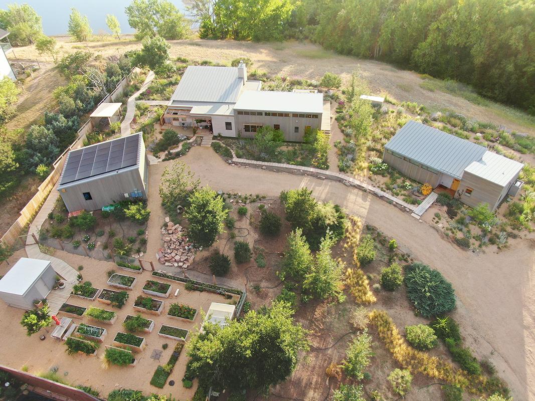
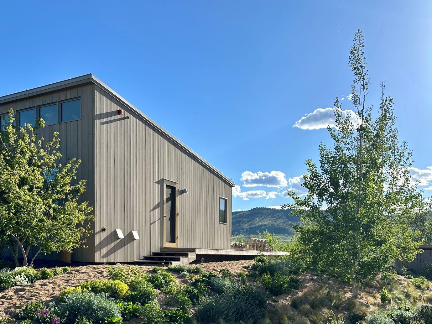
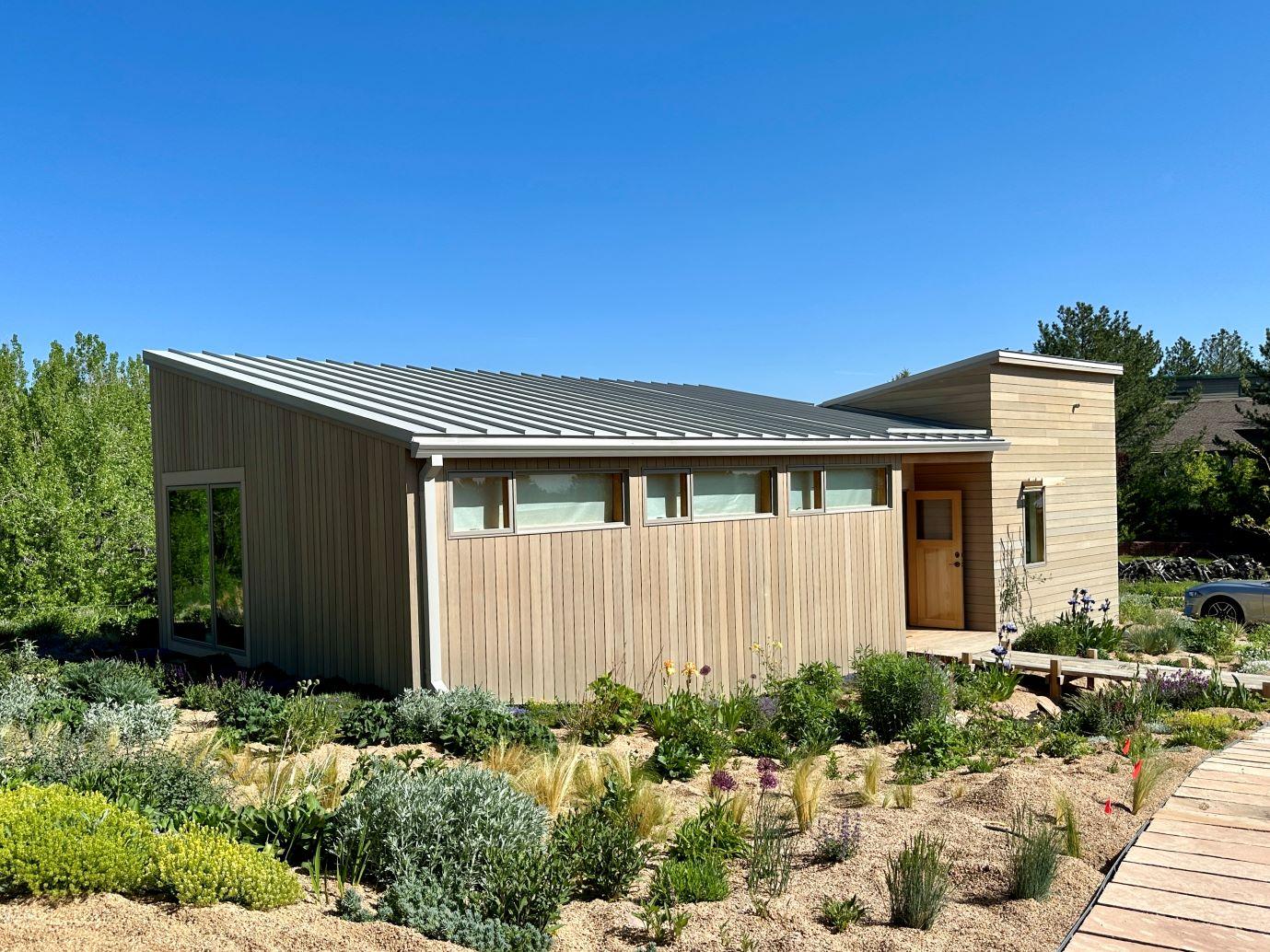
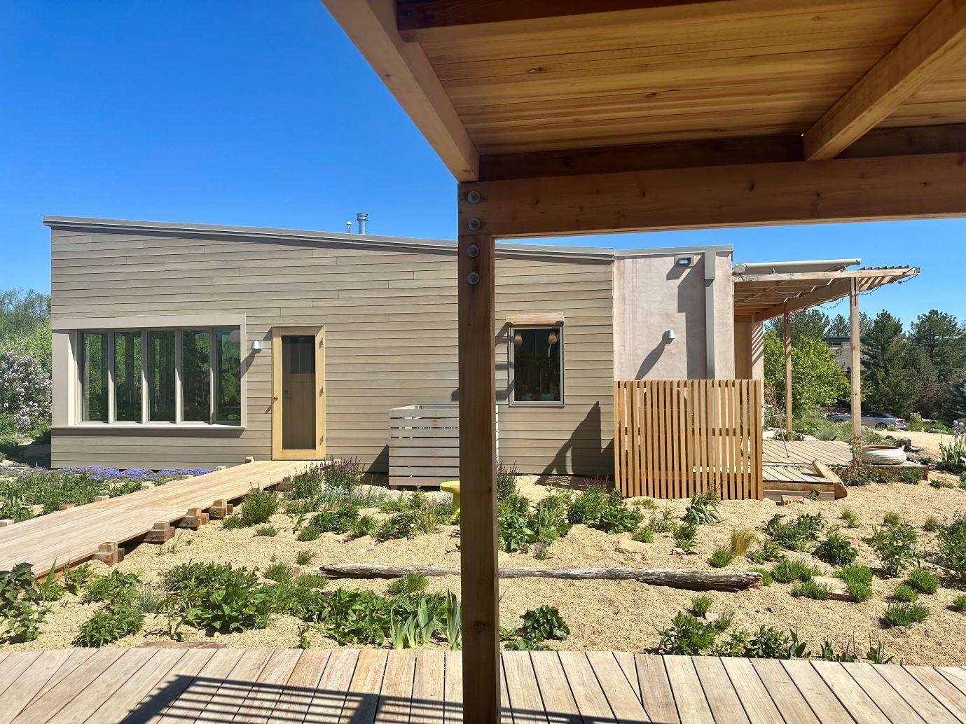
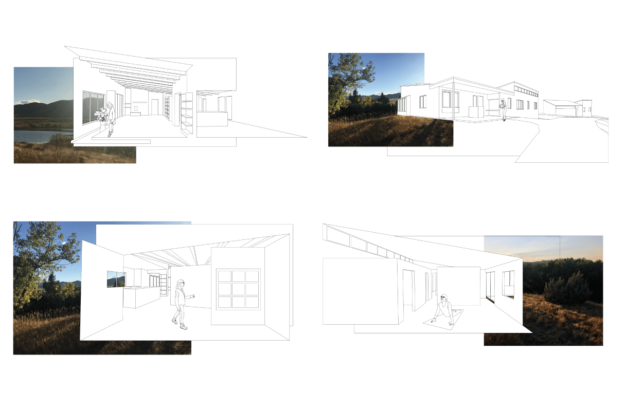
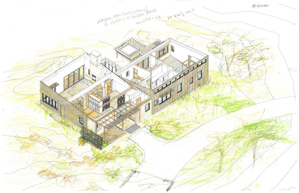
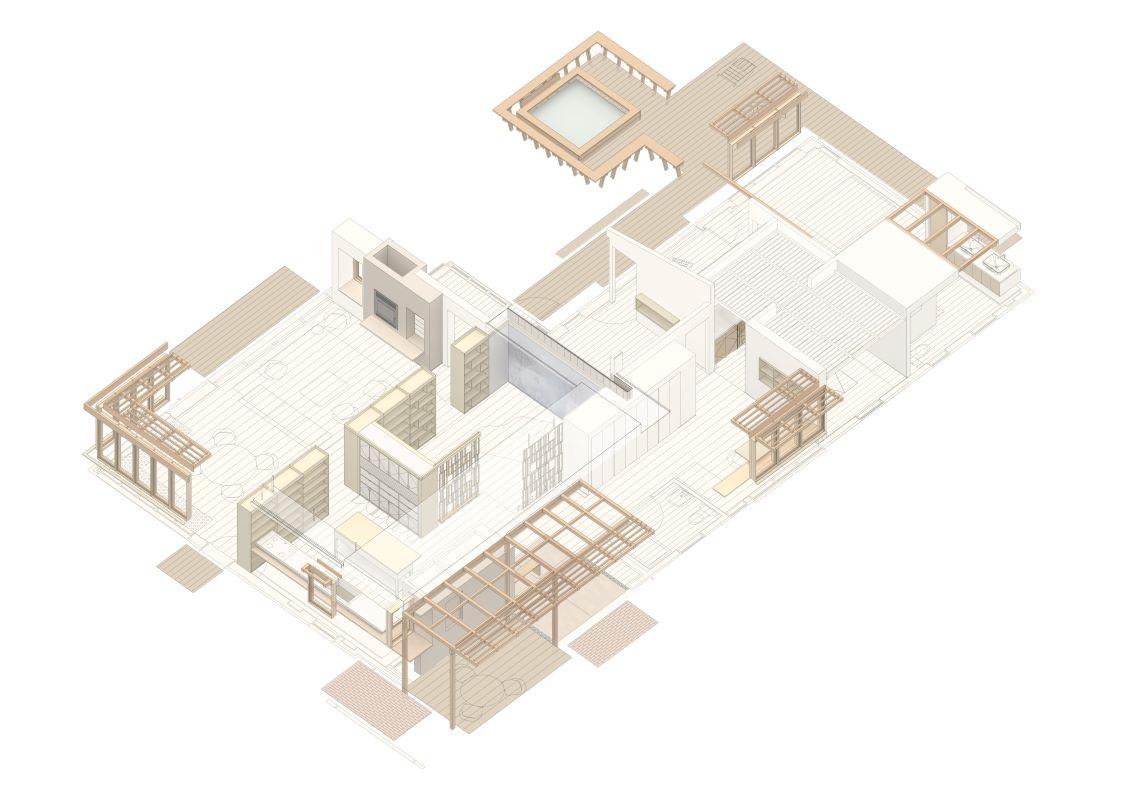
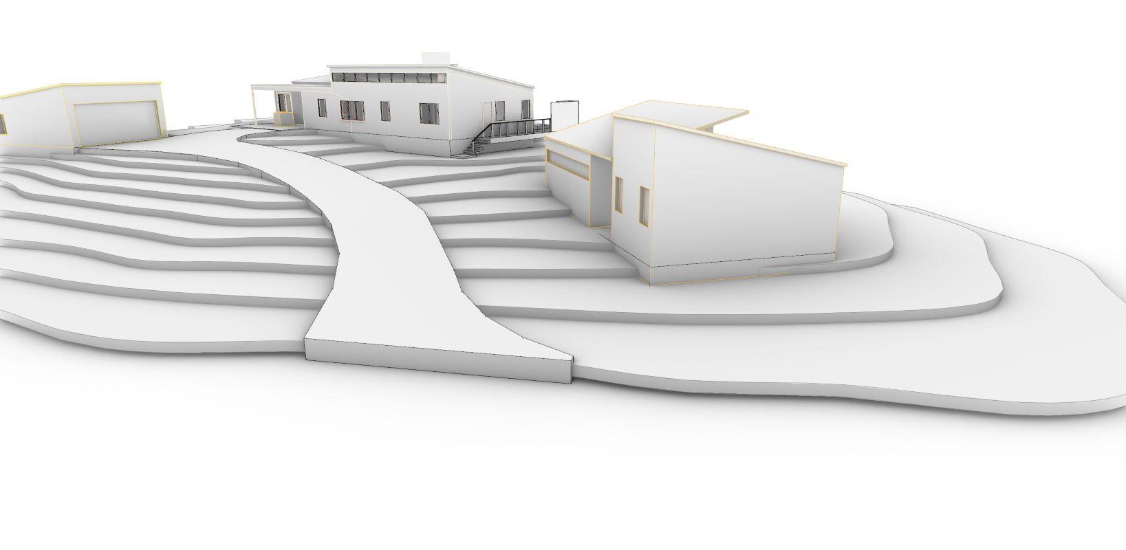
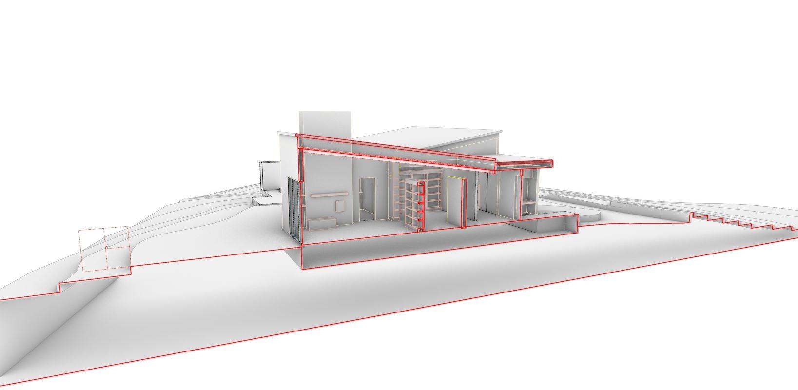
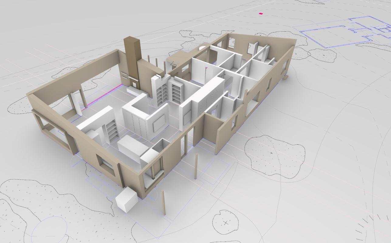
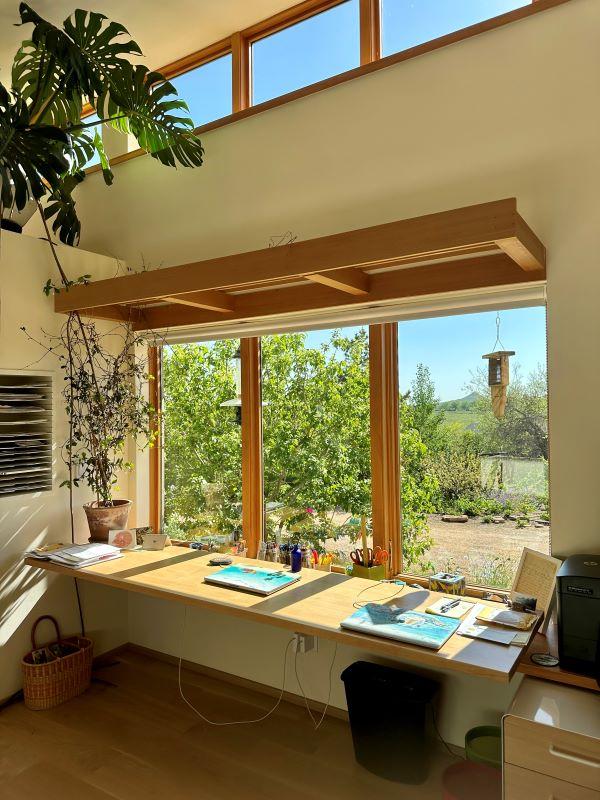
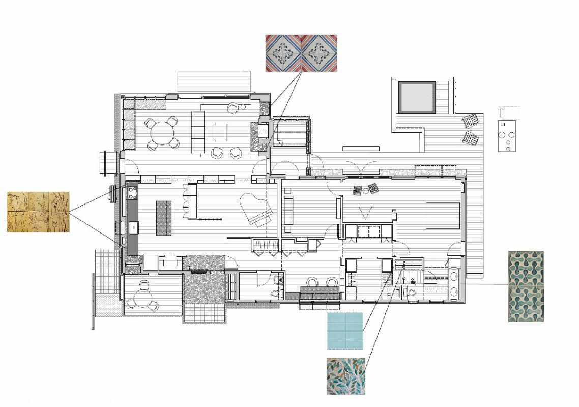
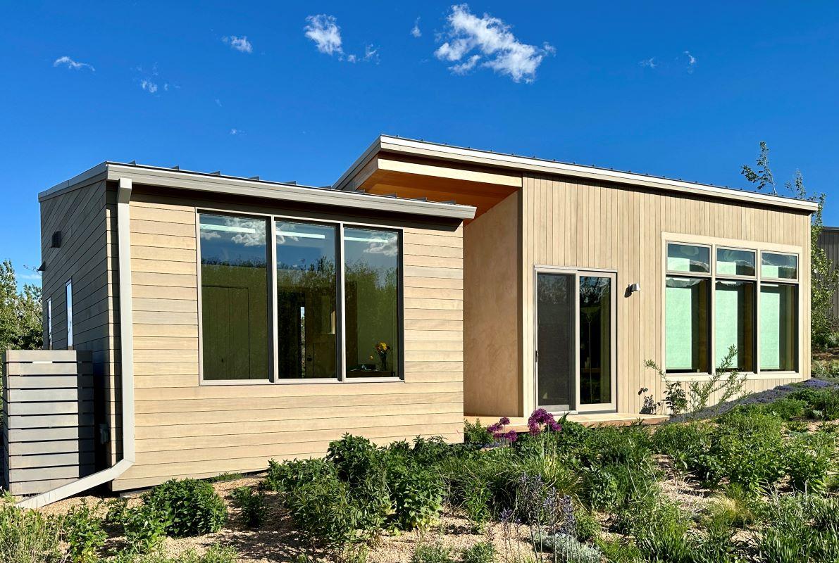
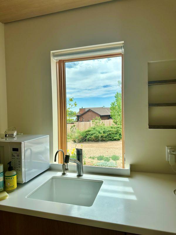
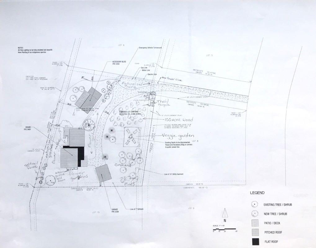
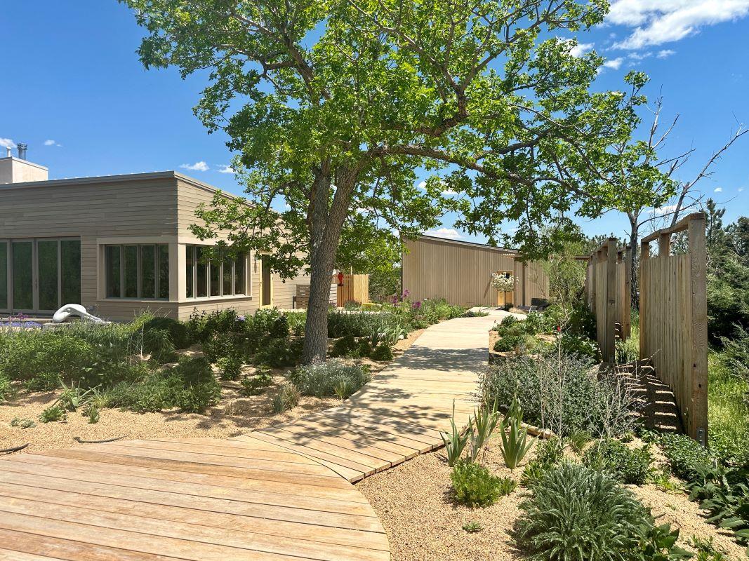
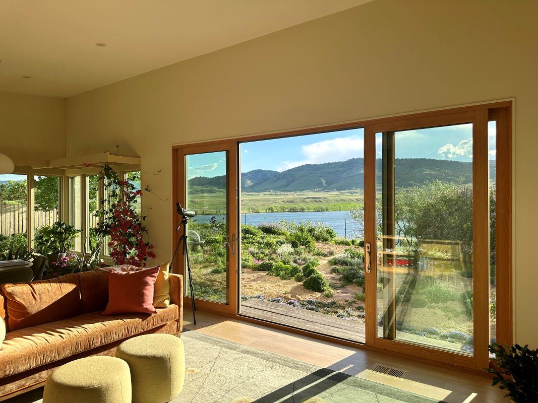
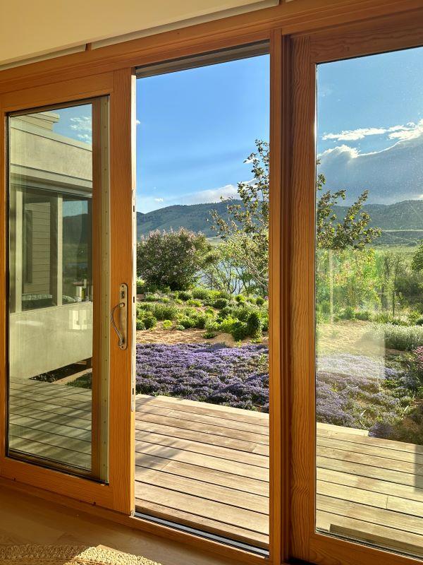
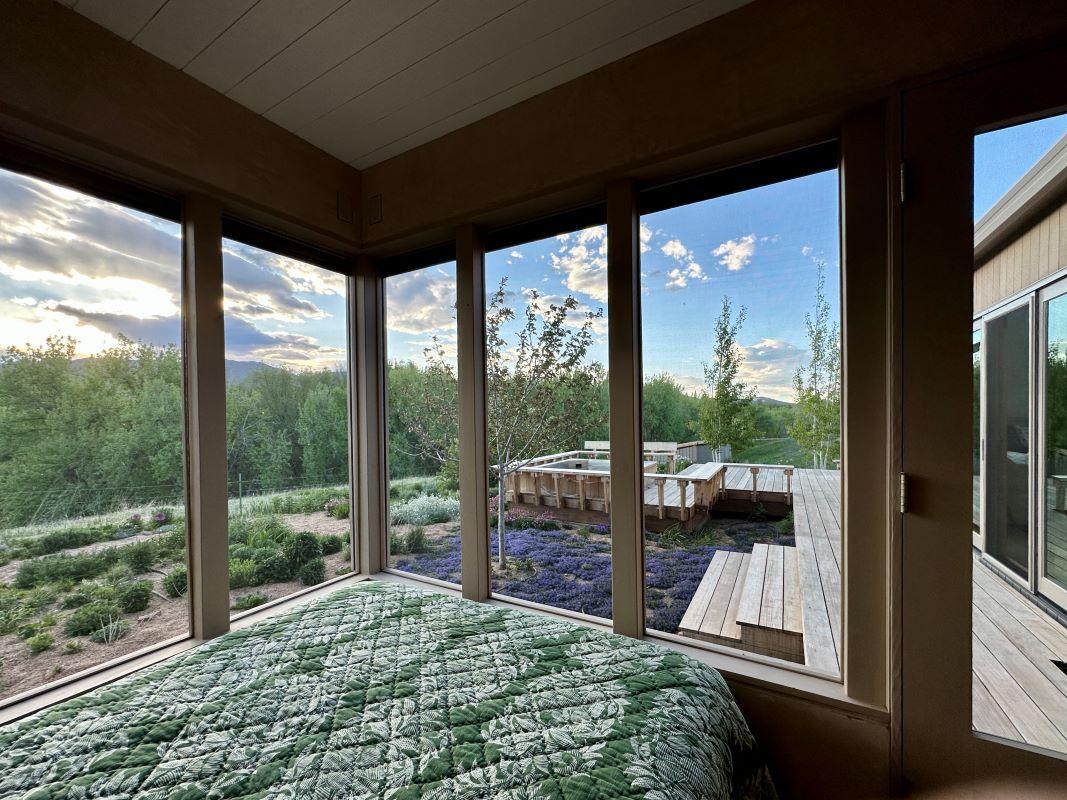
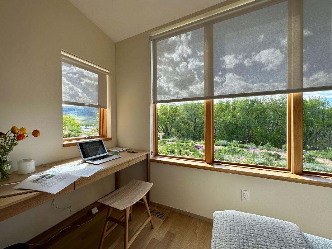
The components of the design are three different buildings: the house, the studio, and the garage. Through its two distinct volumes, private and public, the house facilitates an east-west experience of the ridge. The public volume opens to the expansive western views while the private volume faces east with a continuous clerestory that welcomes the sunrise. Minimal use of stairs allows for flush movement from the interior to the exterior to maximize connections between inside and outside.
Completion Date
2024
Project Team
Owner: Eve Pollak and Kate Mikayan
Design Architect: Marpillero Pollak Architects
Architect of Record: Collaborate Builders
Structural Engineer: Gebau Inc.
General Contractor: Collaborate Builders
Millwork: Beyond the Bark
Site Supervisor: Kate Mikayan
Surveyor: Scott Cox and Associates
Prairie tile: Kate Mikayan and Eve Pollak
Landscape Planting and Walkways: Kate Mikayan and Eve Pollak
Photography
Philip Wegener
Noah Katz
Linda Pollak
Kate Mikayan
Eve Pollak
Design
Concepts
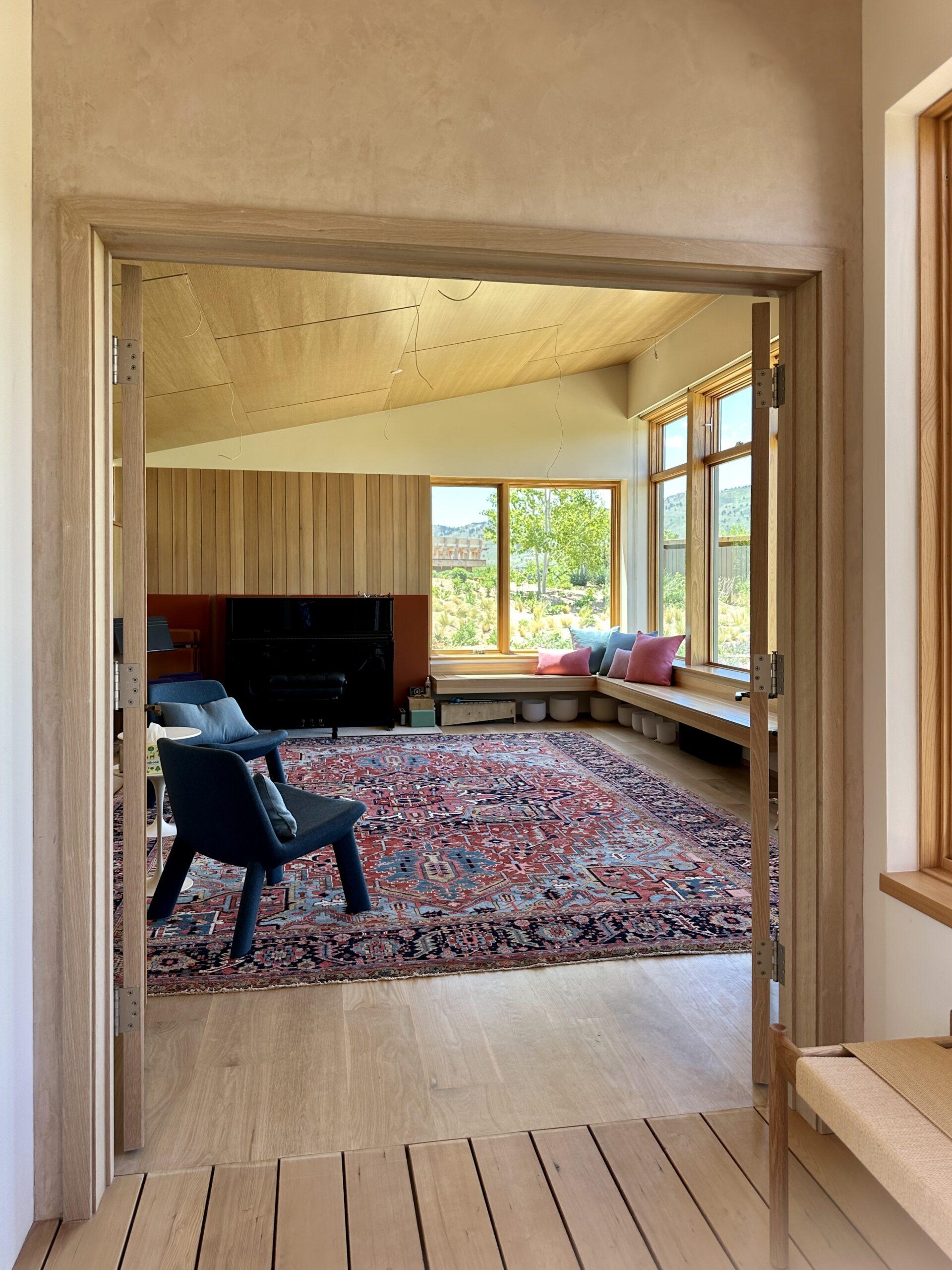
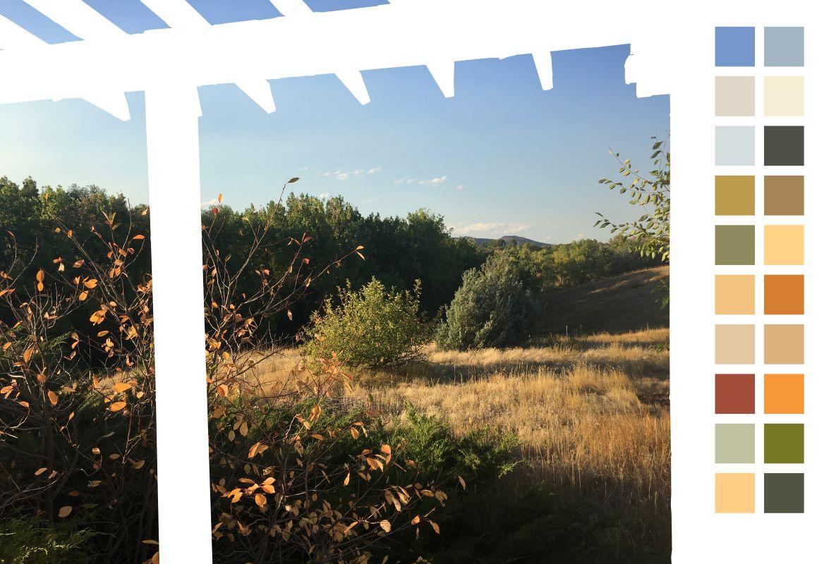
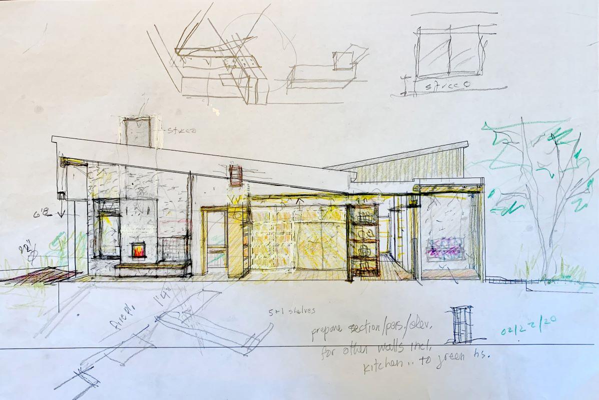
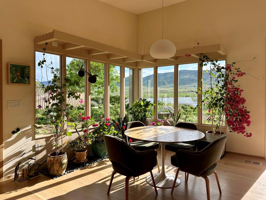
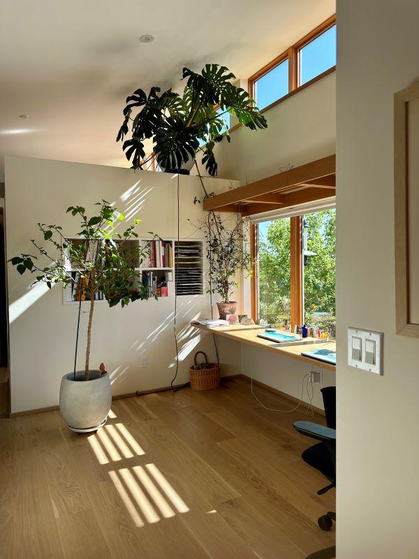
The “prairie” design aesthetic at Fairways Ridge emphasizes transparency and flow, inside-outside relationships, lightness, and soft coloration, utilizing natural and white-stained woods along with botanical elements to integrate the design into the landscape. The slanted roofs, sloping from an 8’ minimum to 12’ maximum, keep the house and studio at a modest scale, making relatively standard-sized openings feel significant. In order to keep the existing foundations and maximize the small footprint, a unique massing strategy breaks down the different spaces of the buildings into boxes as opposed to traditional rooms. None of the interior elements touch the sloped ceiling, allowing for the formation of private spaces while still maintaining a sense of the overall volume. Interwoven tributaries of elements weave together diverse elements and finishes throughout the design, creating a sense of intricacy that avoids elaborate detailing.
Elements
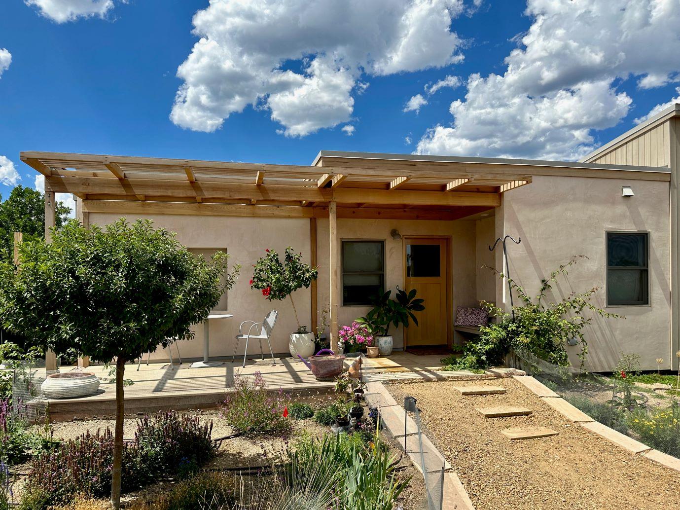
Trellises and Screens
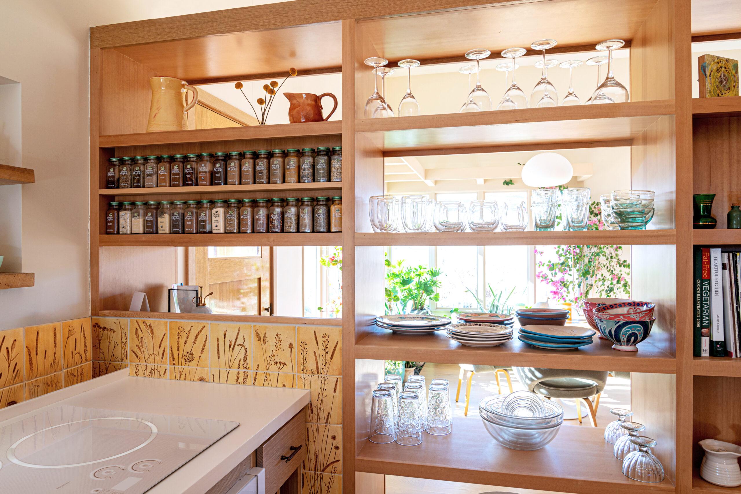
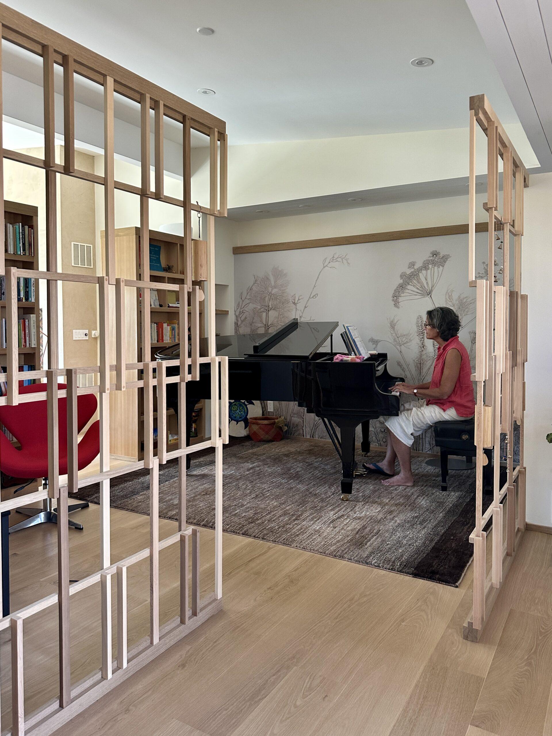
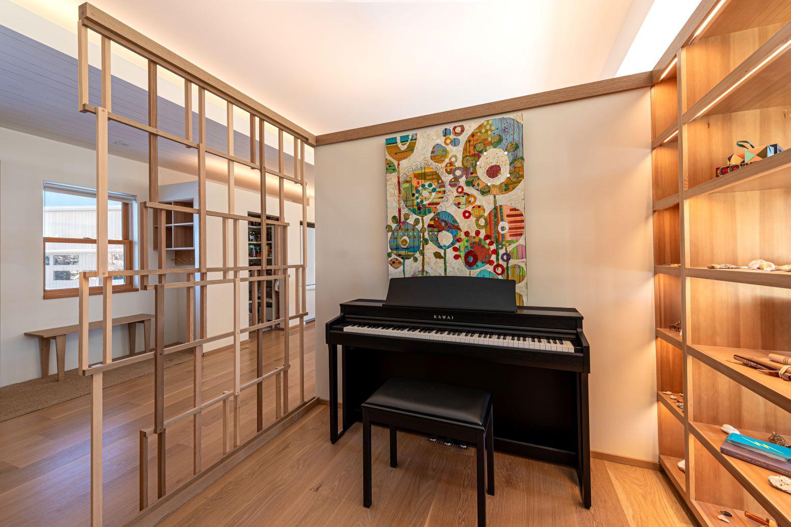
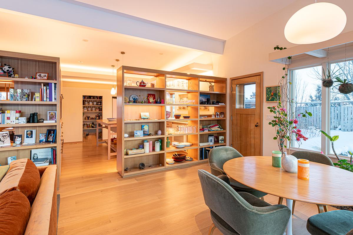
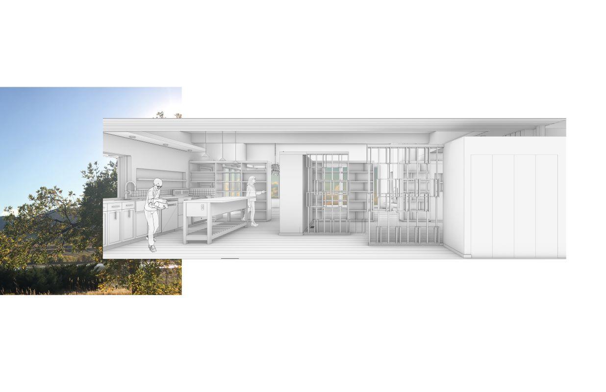
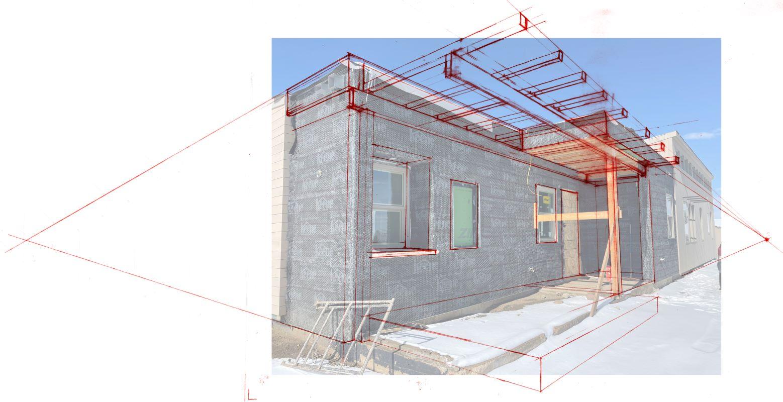
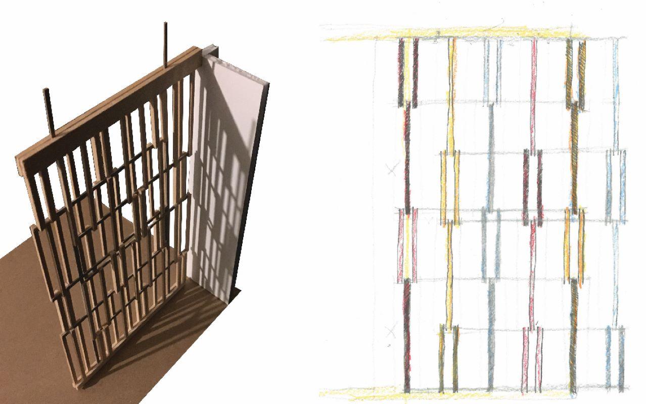
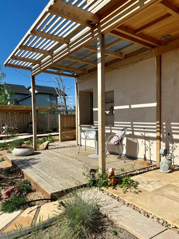
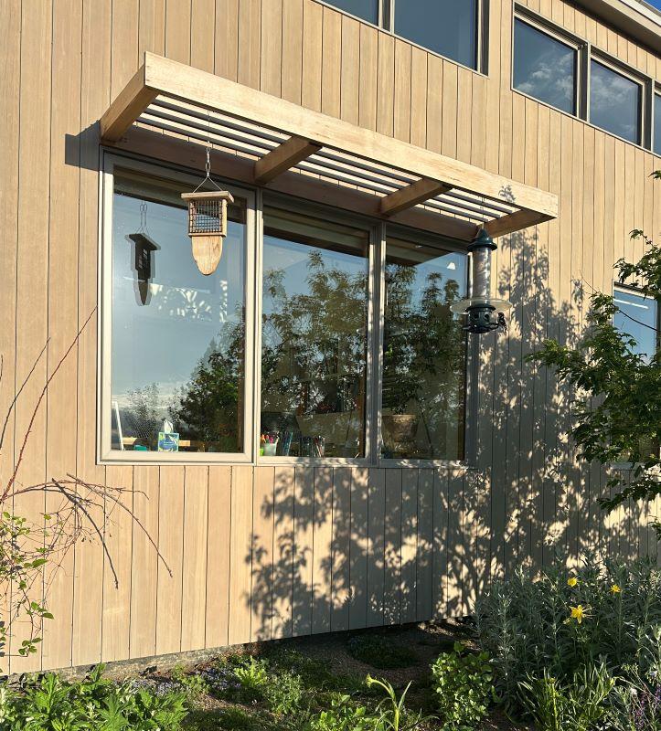
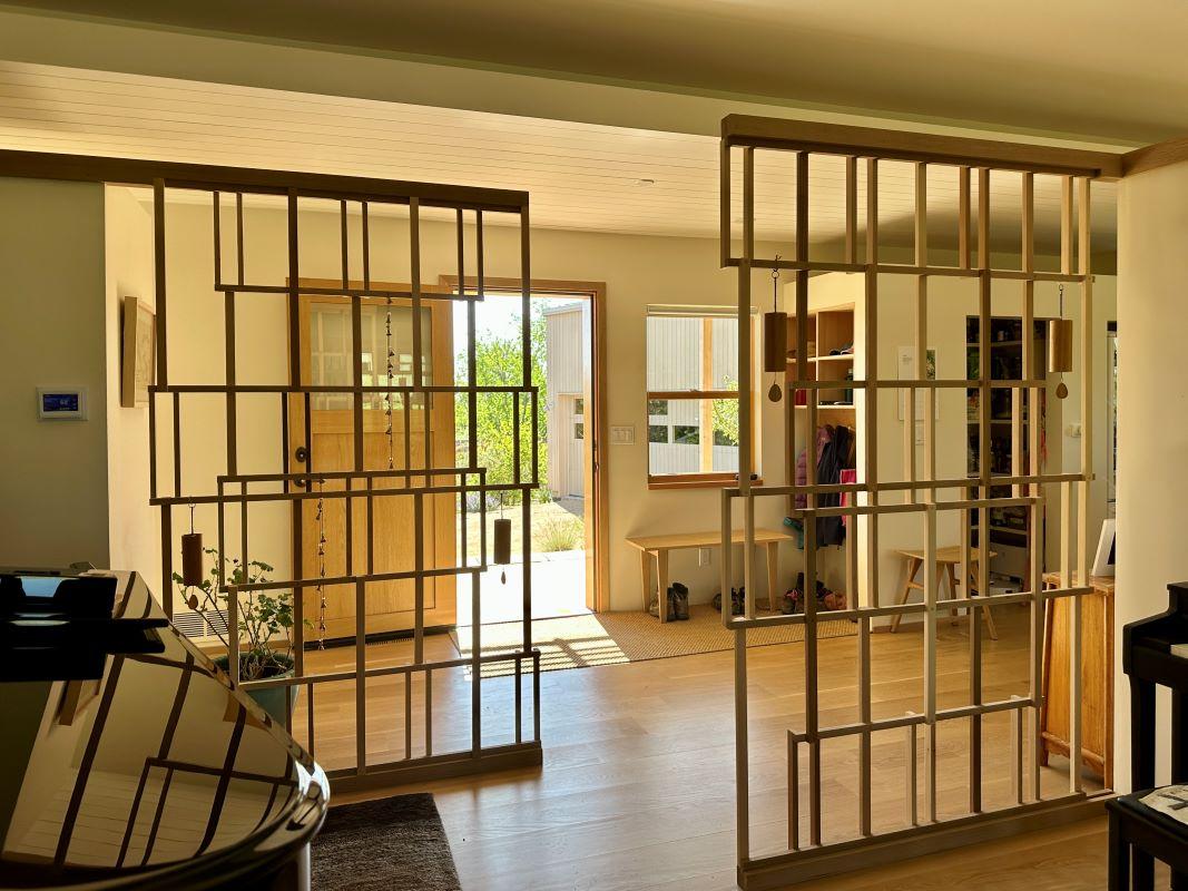
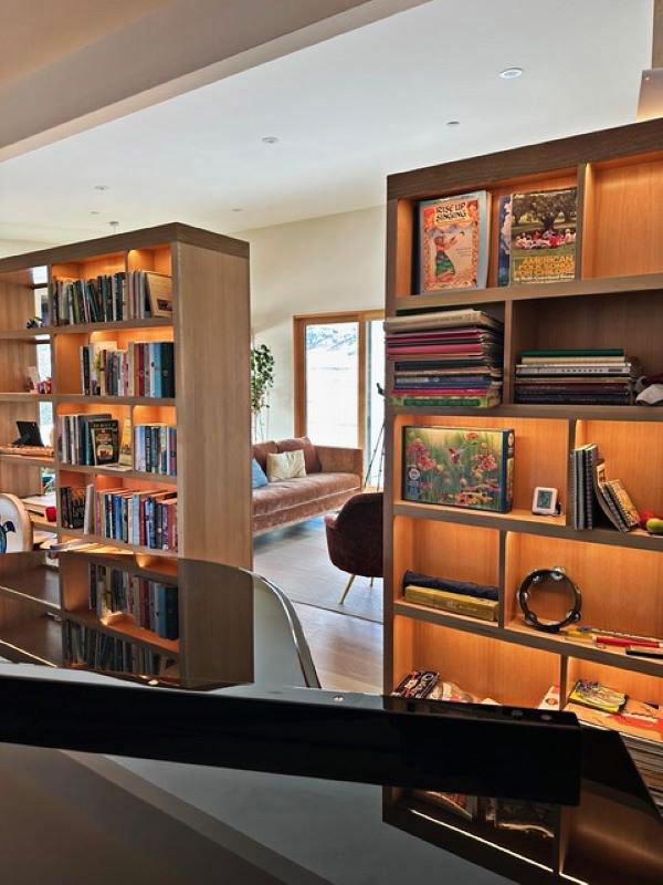
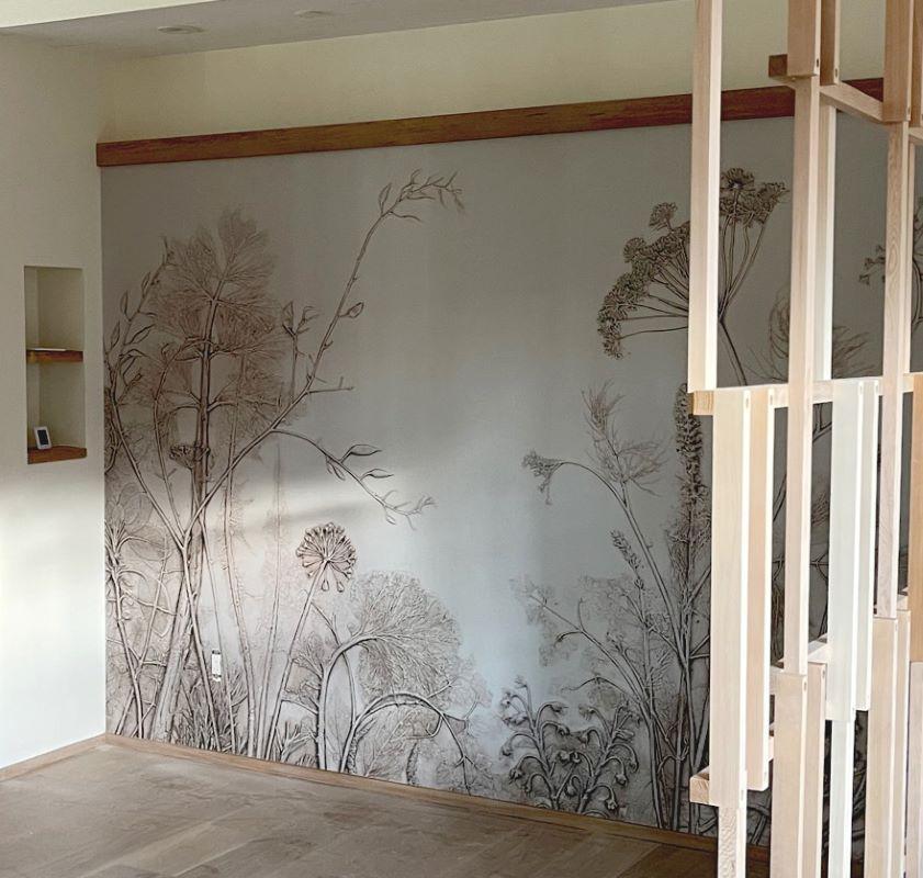
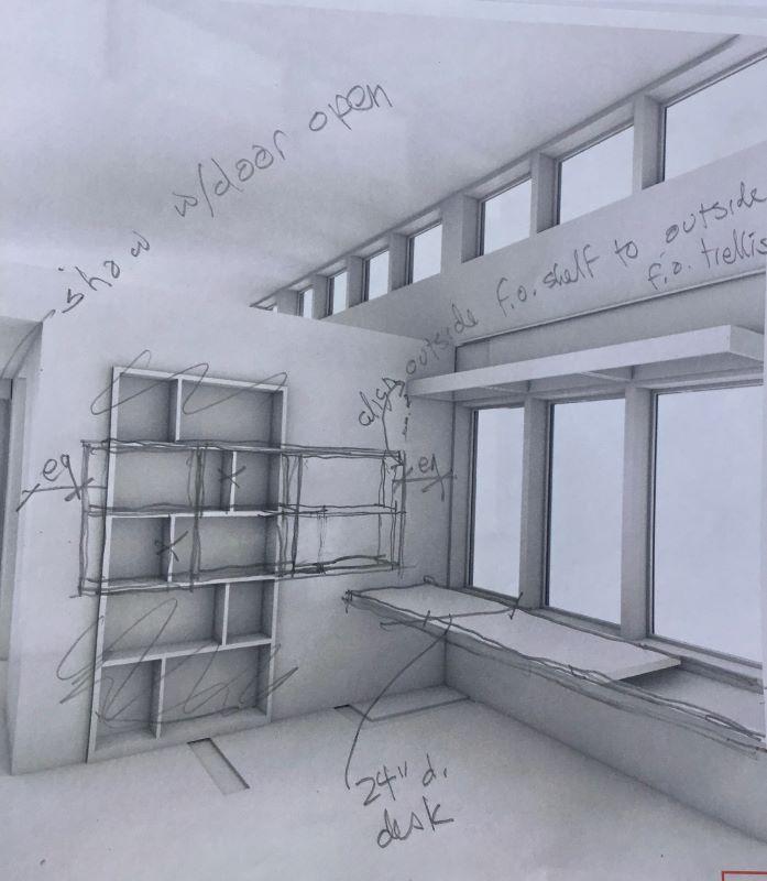
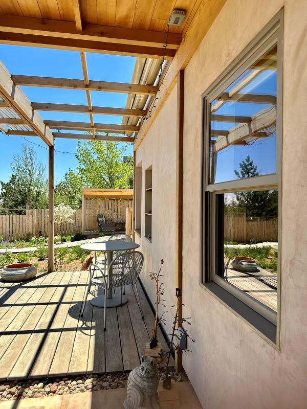
Located around the edges of the house, the trellises mark moments of crossover between inside and outside spaces. While their physical function is to provide support for plants, birdfeeders, and other hanging objects, they also create opportunities for landscape elements to enter the indoors and for built elements to extend into the landscape. As vertical articulations of the trellises, the screens add visual intricacy to the interior of the house. Framing the entrance to the music nook, the screens create a sense of privacy without completely closing off the space. The bookshelf wall interlocks with the music nook screens perpendicularly, adding a unique dimension to the effect of the screens with its combination of open and solid-backed shelves while also organizing the house’s public spaces (dining room, living room, kitchen, music room). The transparency and weaving effect of the openwork elements create a sense of visual curiosity as one moves through the house.
Surfaces
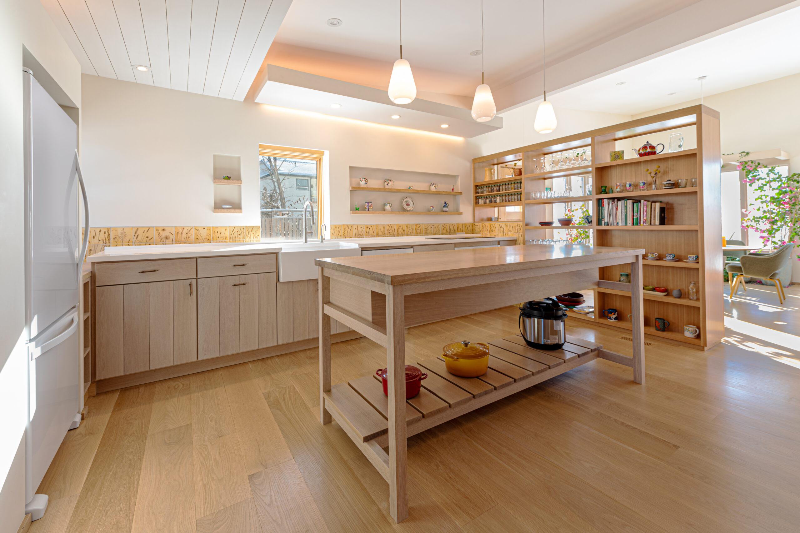
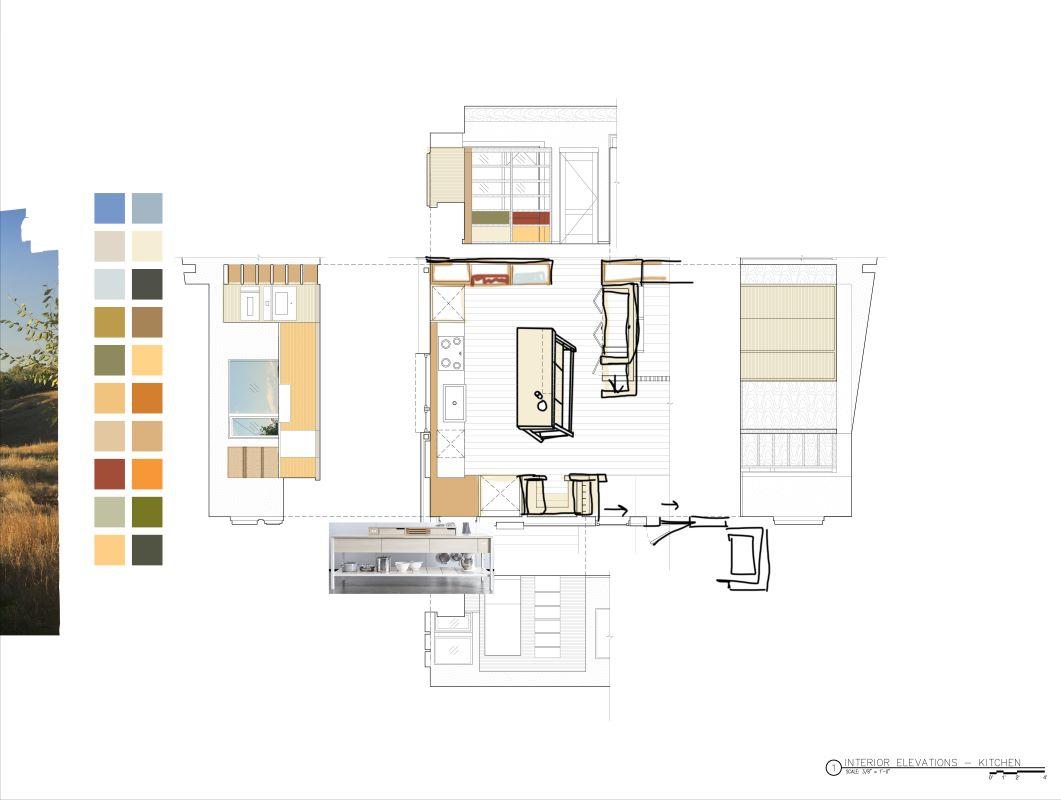
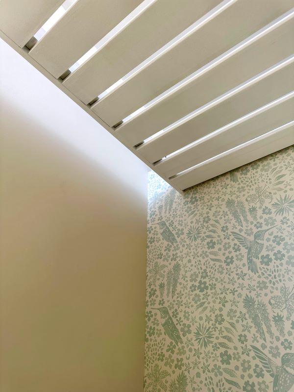
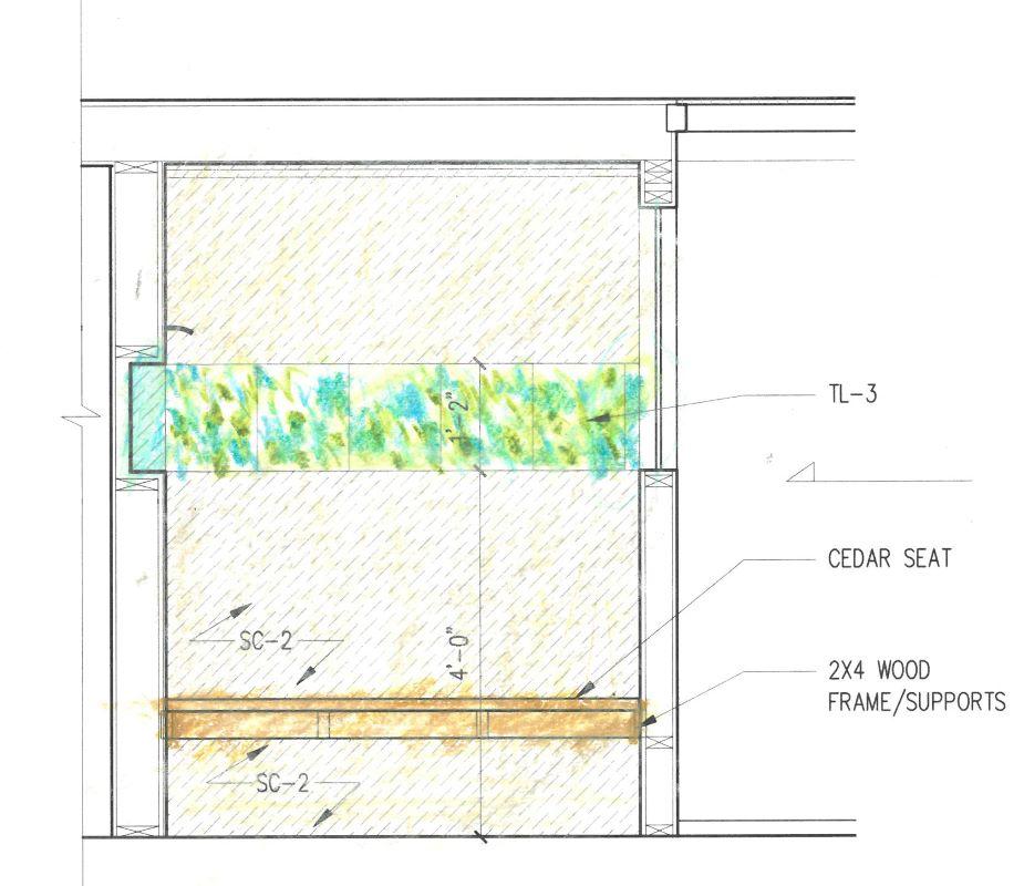
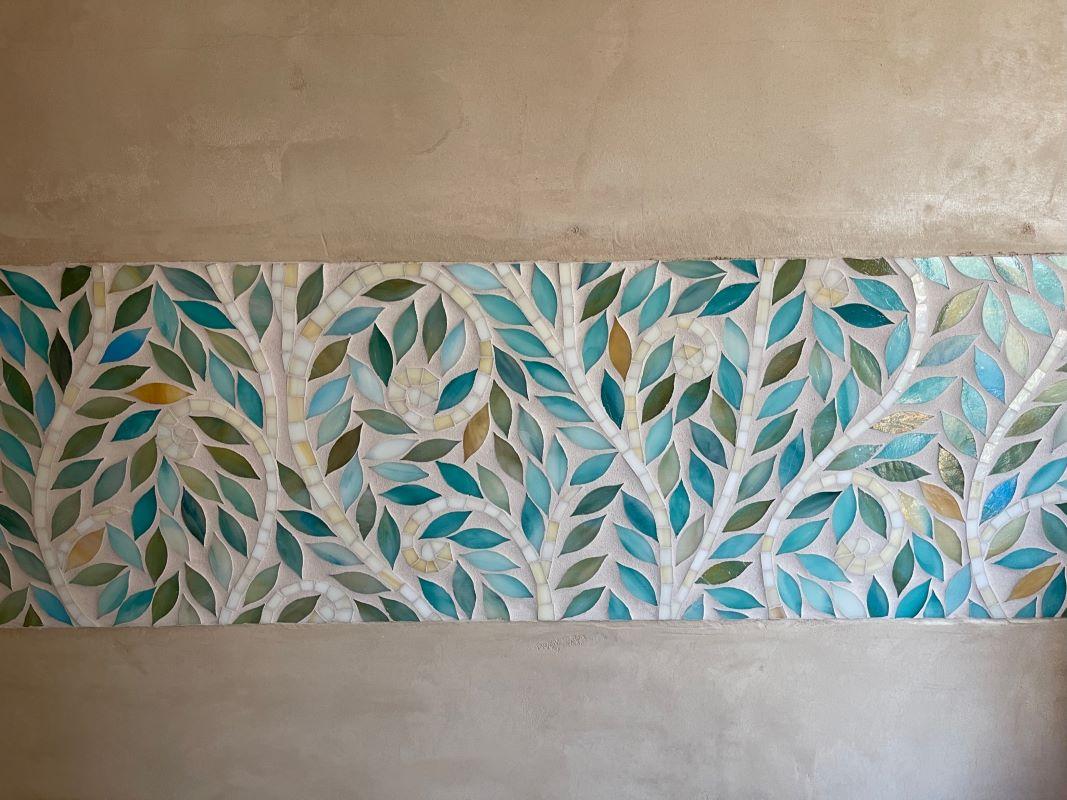
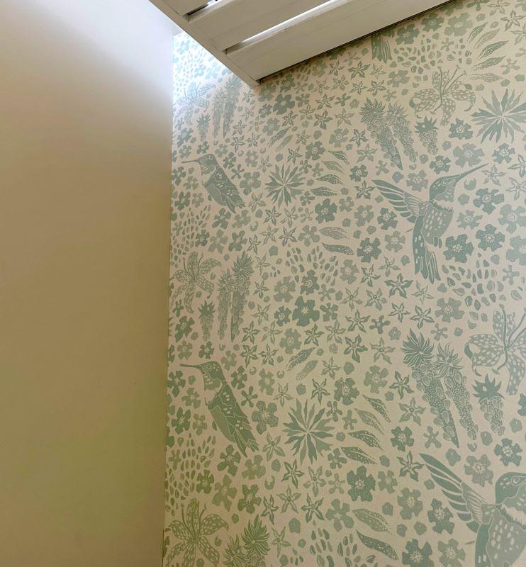
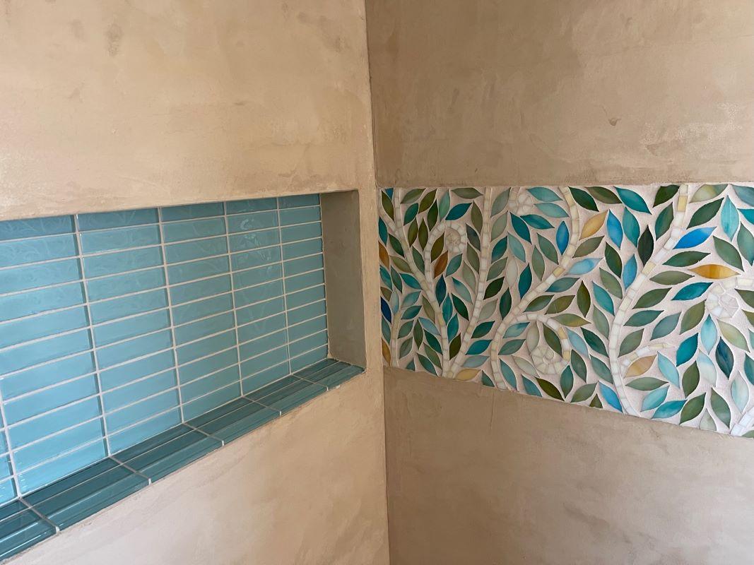
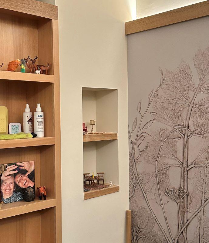
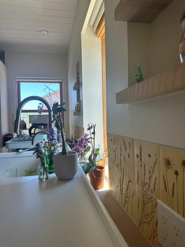
Surfaces were used as opportunities to express the clients’ personal aesthetic and fulfill their desire for a colorful space. The botanical kitchen tiles were handmade by Eve and Kate using flowers picked from their garden. The gravel integrated into the floor of the dining greenhouse brings a typical outdoor material to an indoor space. The music nook and laundry room feature two different kinds of botanical wallpaper. Pieces of salvaged wood were used to make the doors of the medicine cabinets in the master bathroom, introducing a new textural element. The alternating vertical and horizontal cladding on the exterior of the house and studio signals the weave-like language of the trellises and screens.
Cut Outs
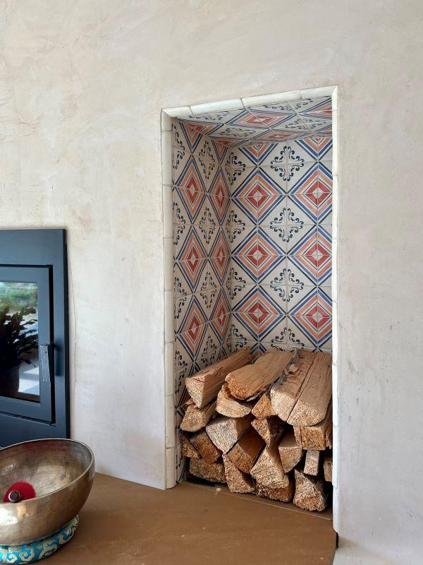
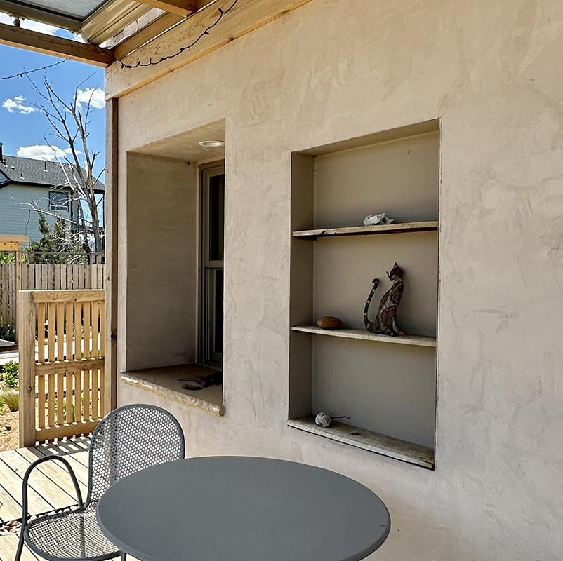
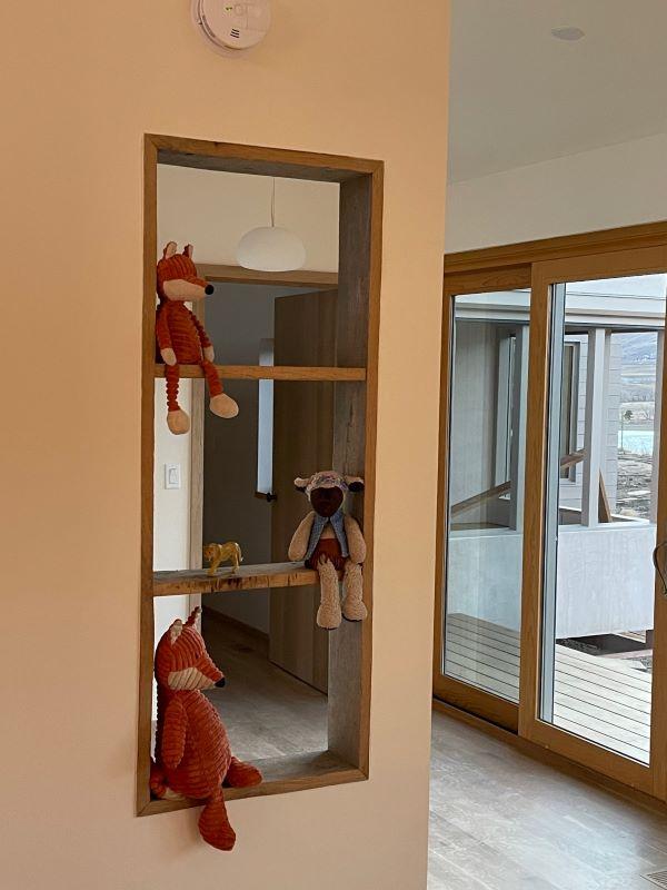
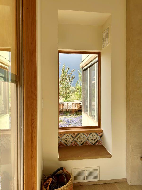
The niches and wells situated throughout the house and studio form a network of interior cut outs. The niches take on the language of a typical window without fully penetrating the wall; these recesses become intimate places to display personal objects, contrasting the vastness of the views that are framed within the windows. The two wells, one in the studio and the other in the house, act as spacers between the walls and the kitchen countertops, allowing the counter to become its own figure within the room.
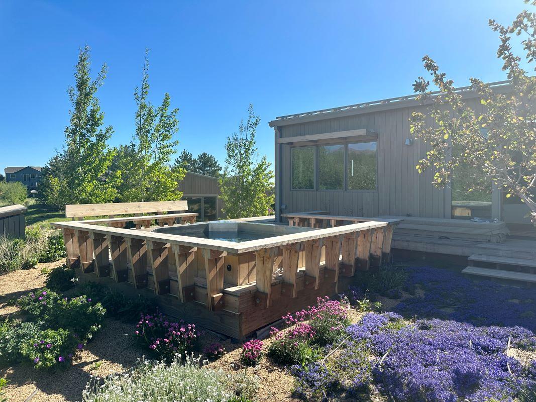
Hot Tub Basket
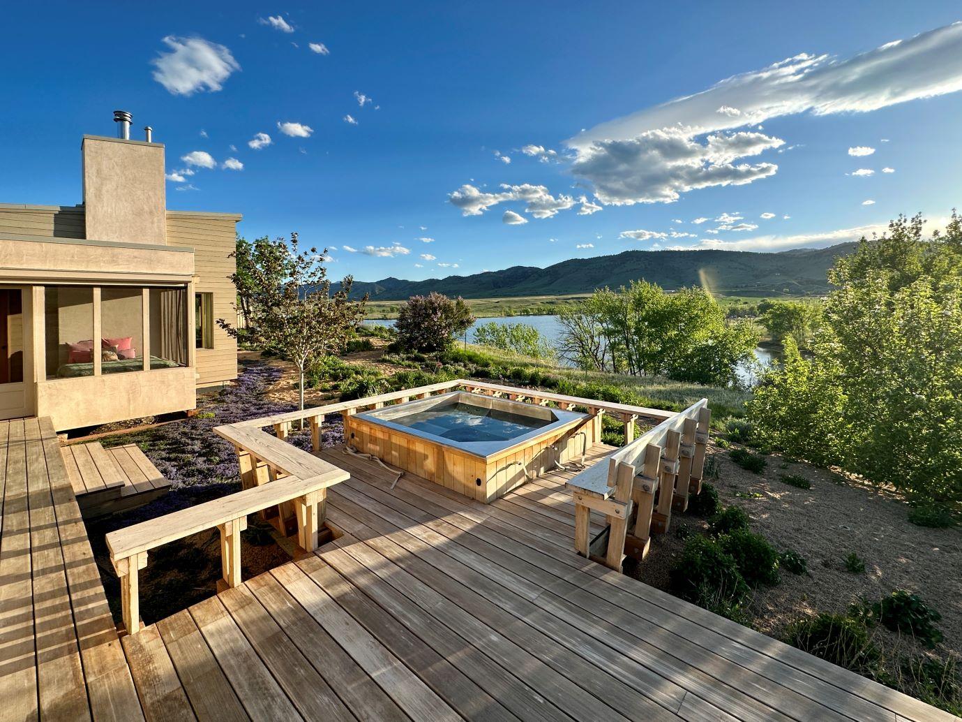
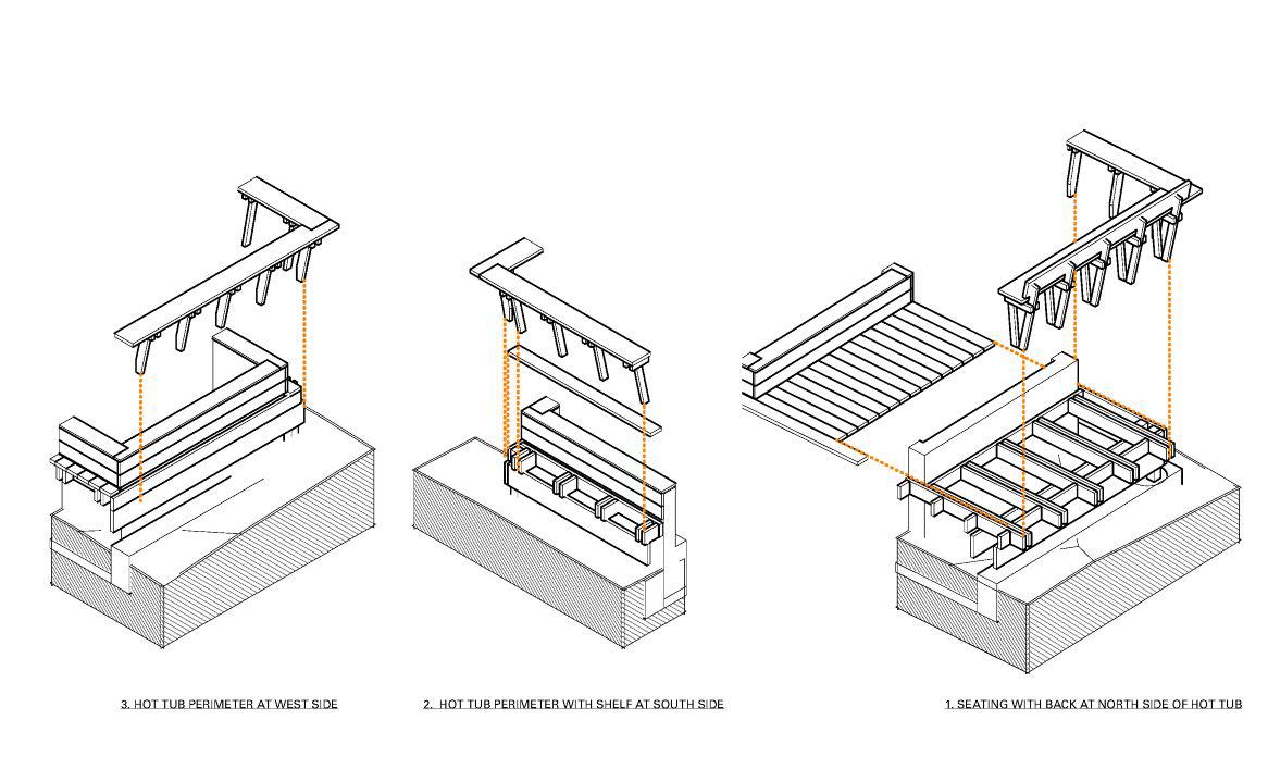
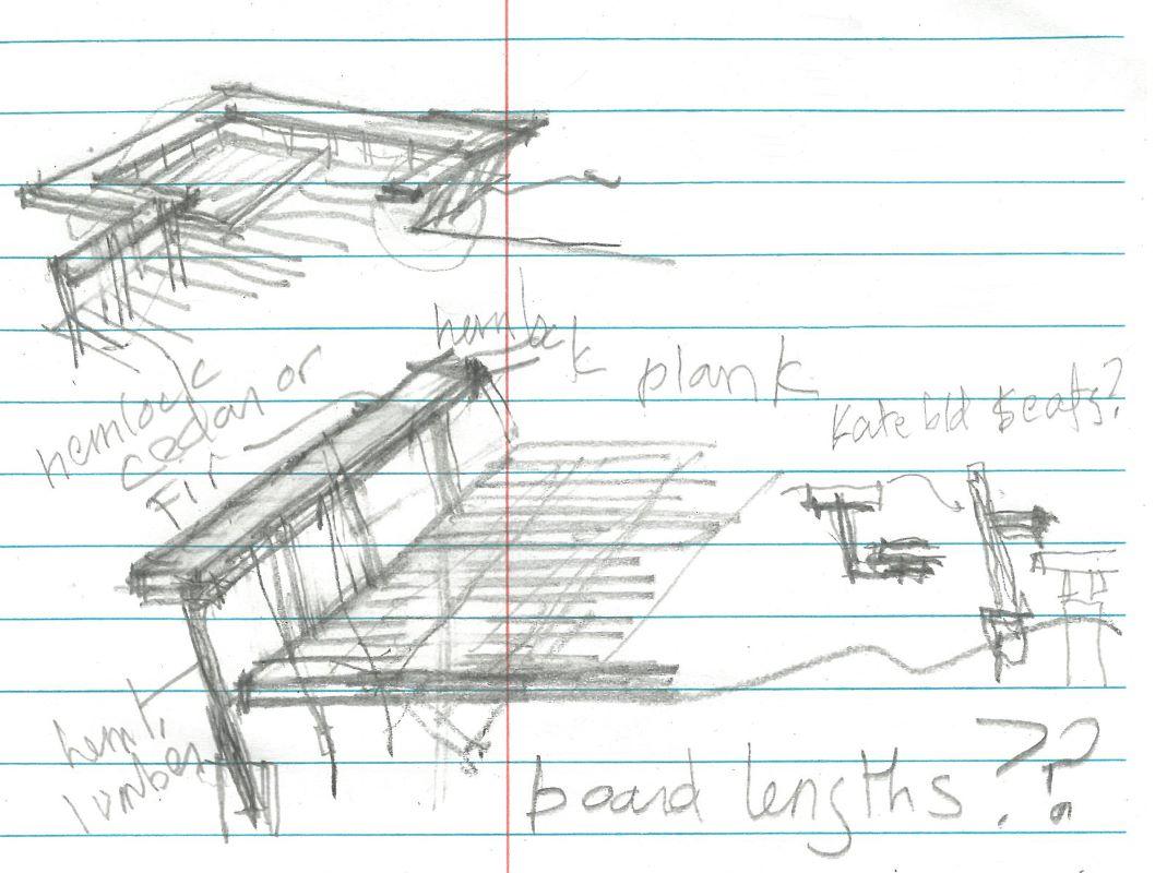
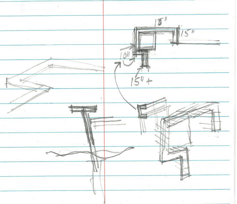
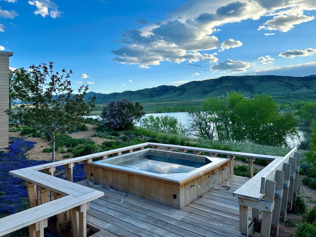
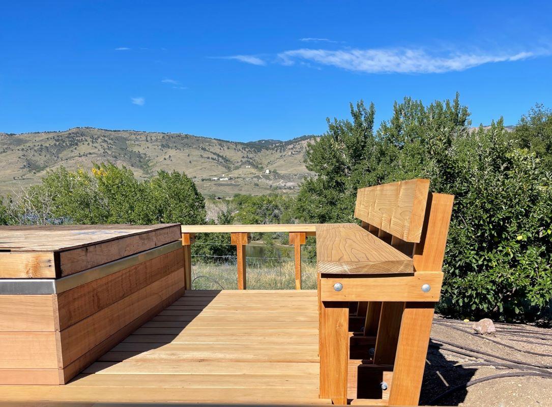
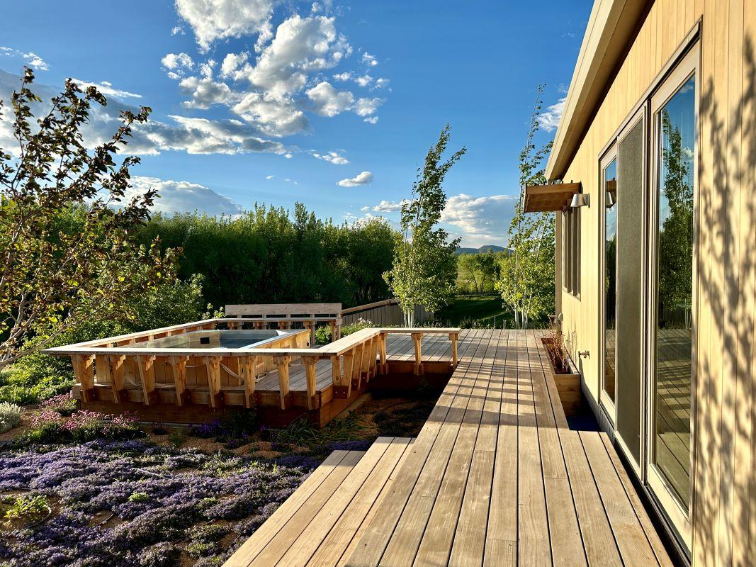
The hot tub basket is designed to contain the massive hot tub in a way that integrates it with the rest of the house. Primarily made of cedar, the somewhat unfinished appearance of the basket contrasts the intimate quality of the niches throughout the interior of the building. The hot tub basket is situated on the west side of the house, making it an ideal space to take in the view of the mountains and reservoir.
Plantings
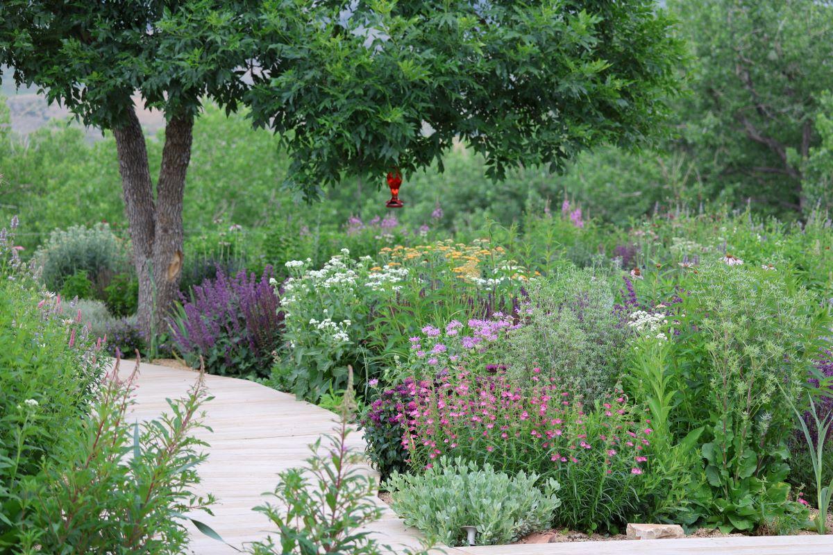
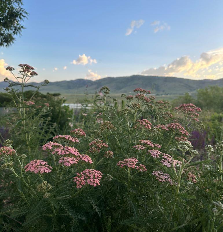
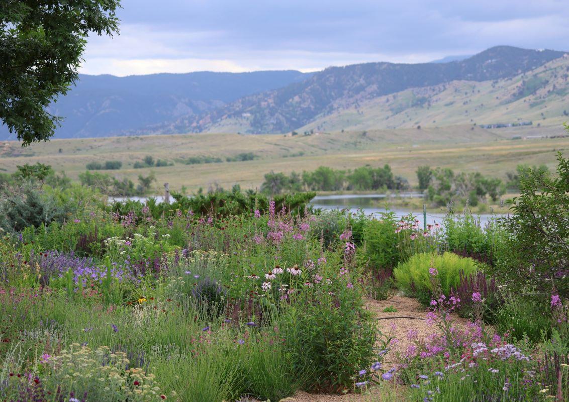
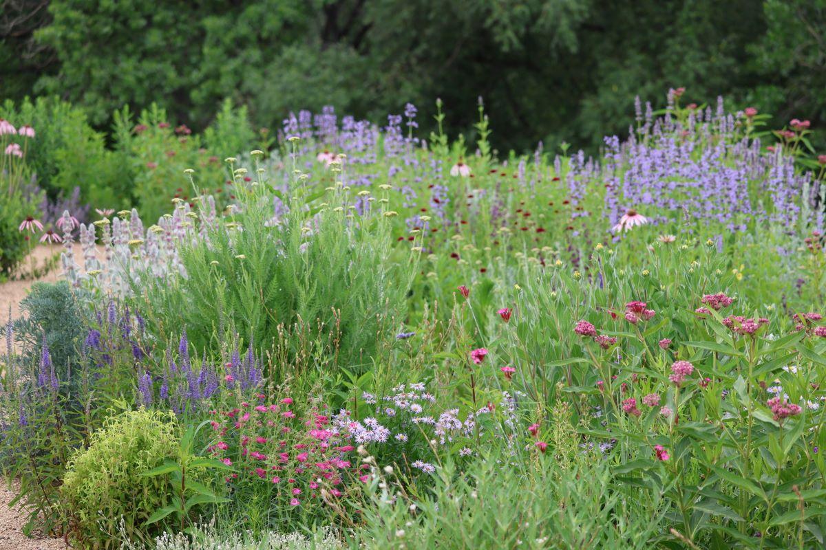
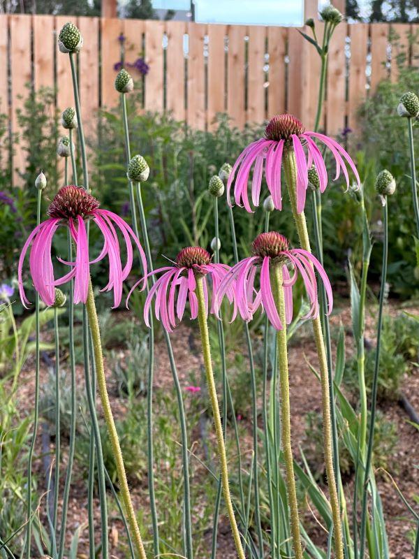
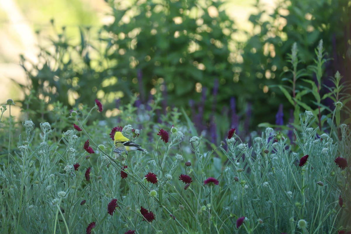
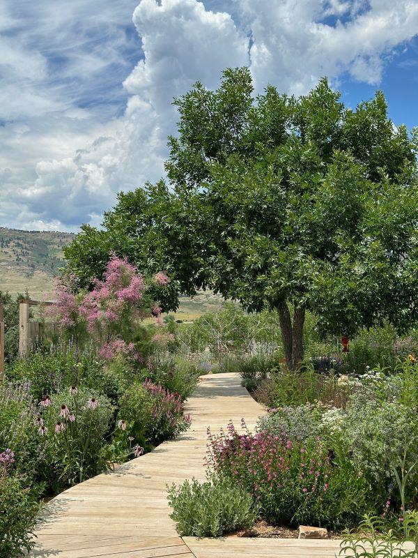
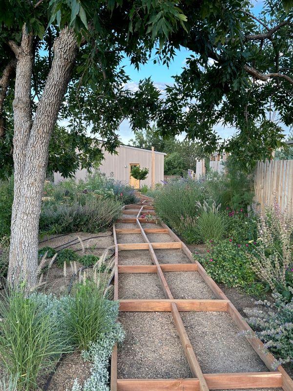
After construction of the house and studio were complete, Eve and Kate planted 14,400 different plants throughout the Fairways Ridge landscape. From peonies to allium to sunflowers, the plantings blossomed into a vast sea of pink, purple, yellow, and green by the spring of 2023, bringing a completely new dimension to the aesthetic of the built elements. Eve and Kate often pick wildflowers from their garden to display throughout the house alongside their indoor plants.
Walkways
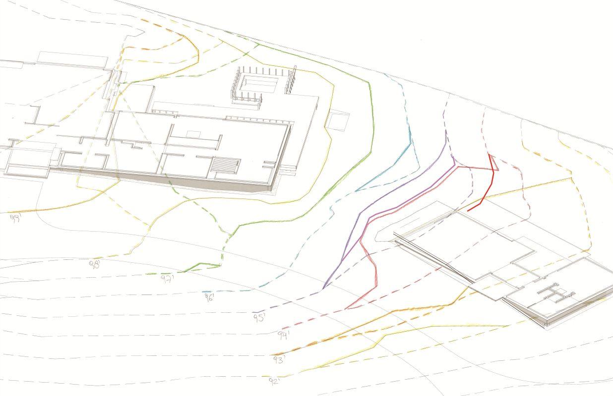
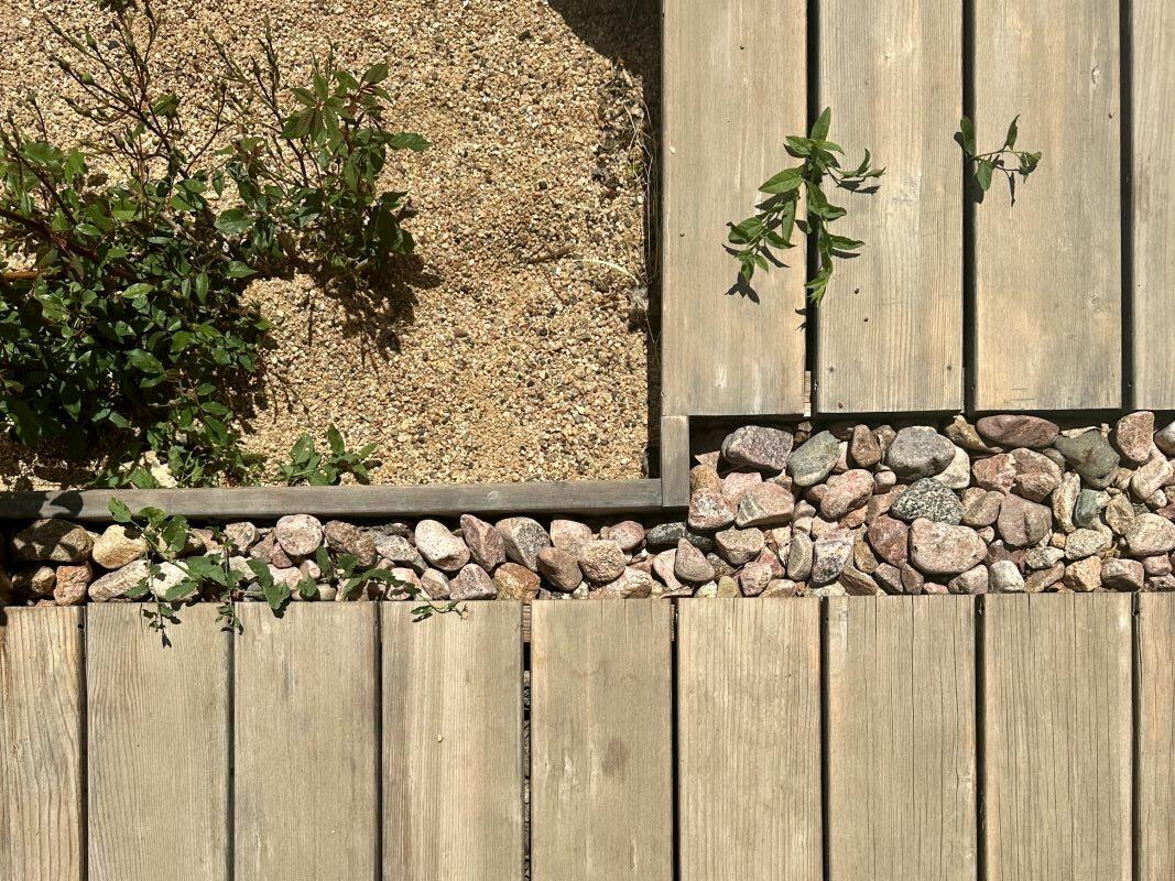
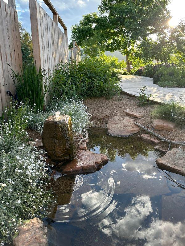
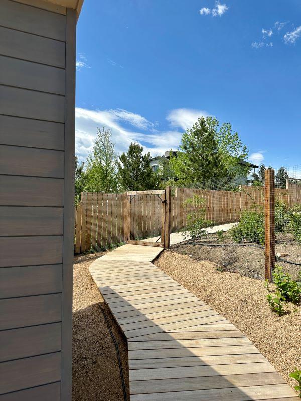
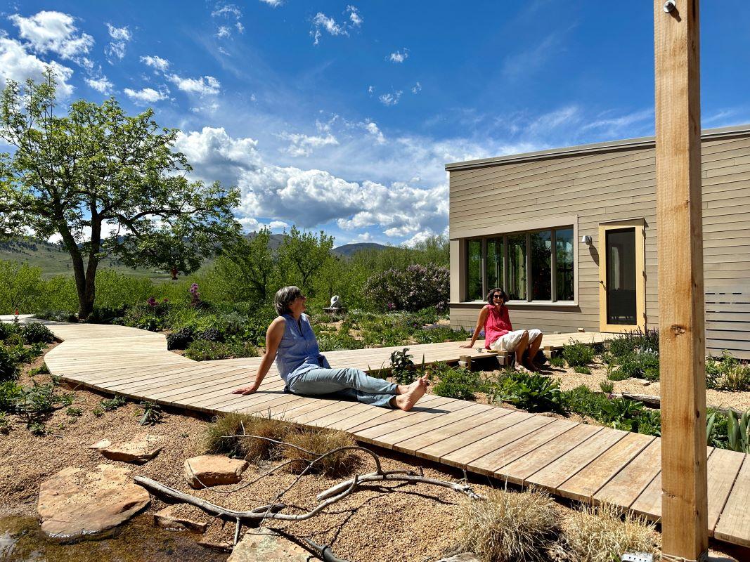
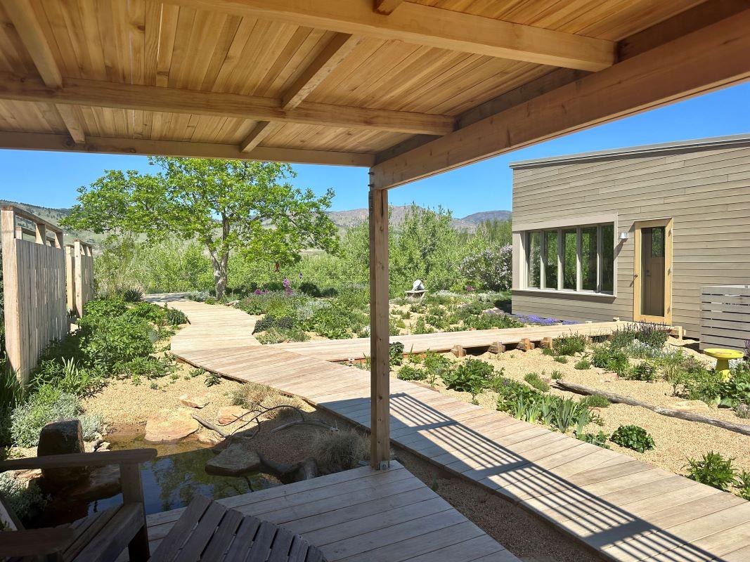
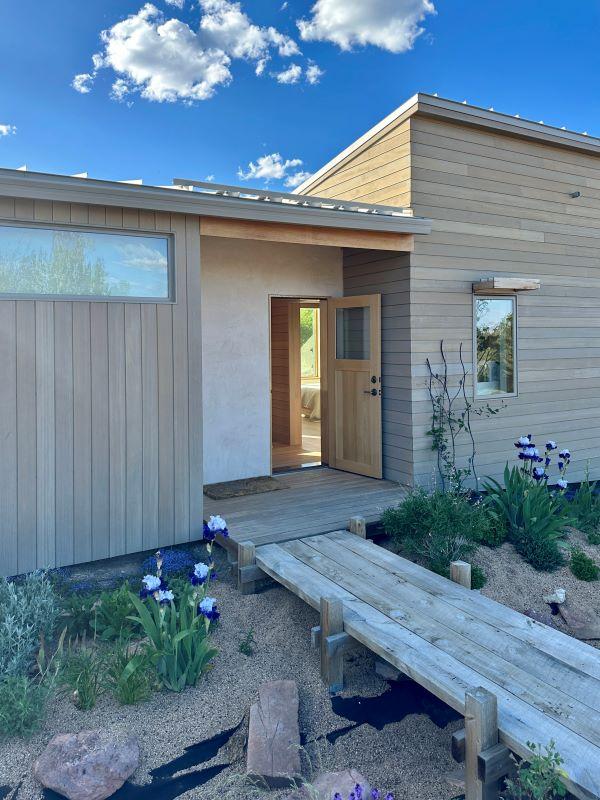
The exterior walkways, designed and constructed by Eve and Kate, cultivate connection and continuity between the house, studio, and garage. The path of the walkways relates to the topography of the site, providing a safe way to navigate the landscape. As a response to an error in grading, a bridge-walkway was constructed at the entrance to the studio.
Inside/Outside
Thresholds and Displacements
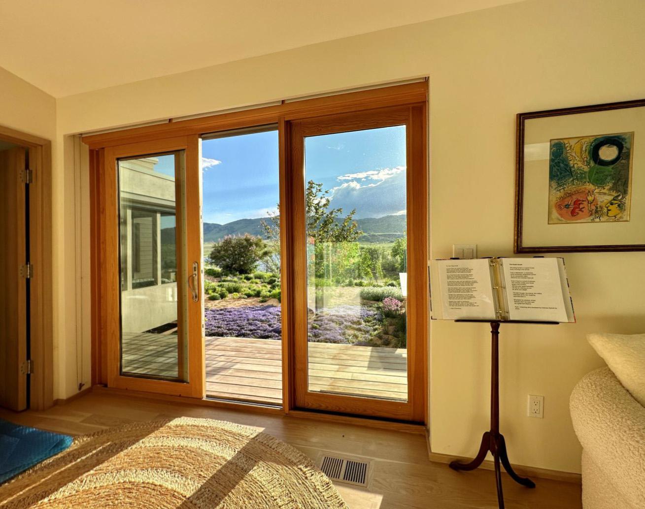
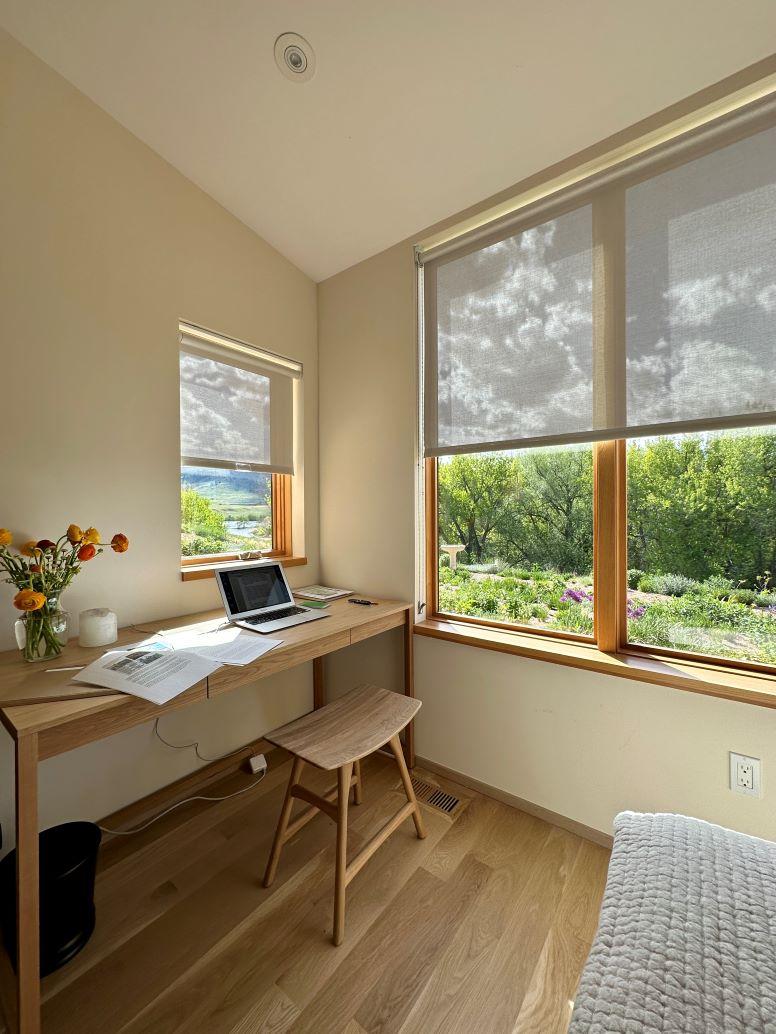
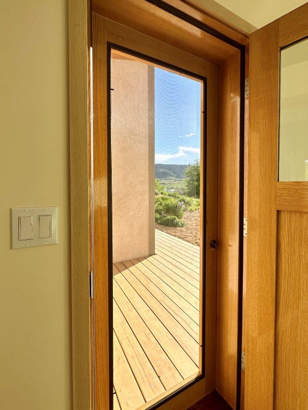
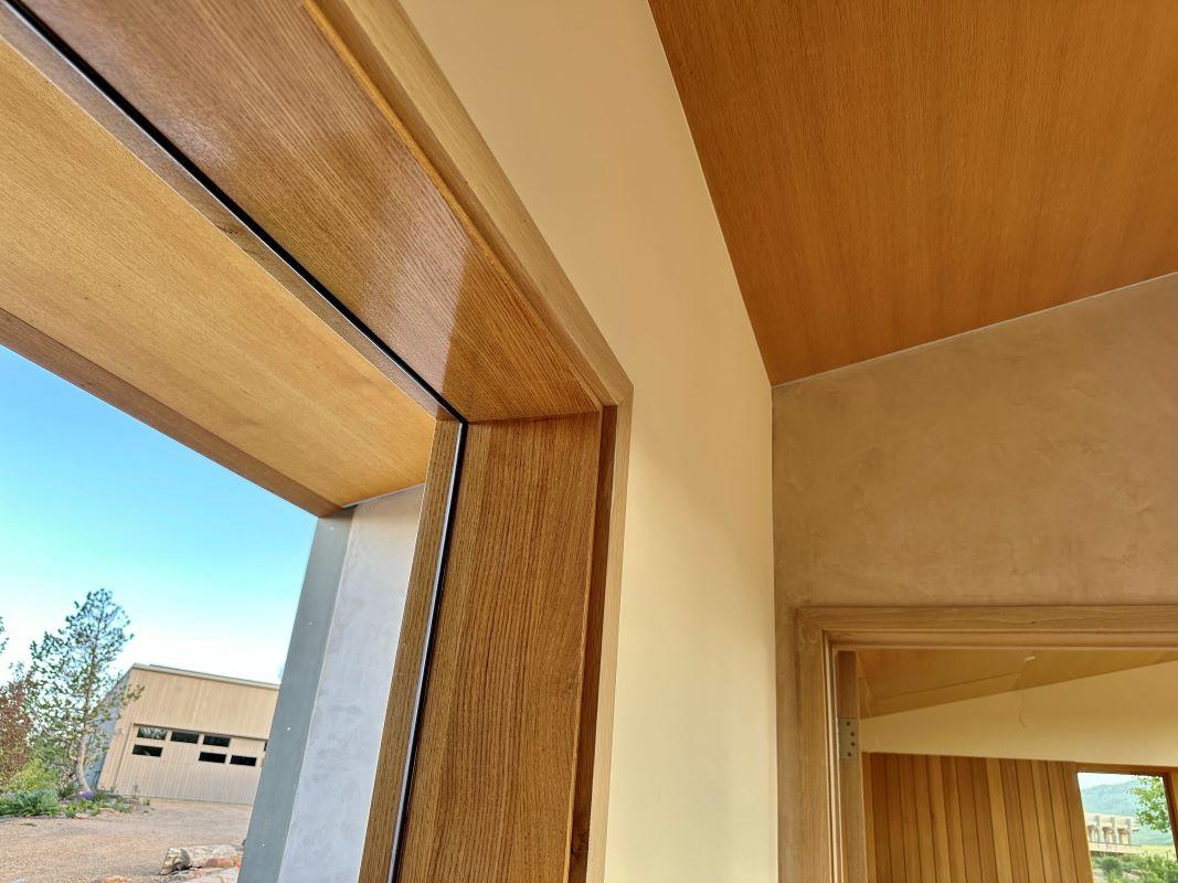
The dynamic between inside and outside at Fairways Ridge is activated not only by the various thresholds and their framing of landscape views, but also through the thoughtful displacement of materials, patterns, and design elements into unexpected places. Each of the doors and windows exhibit different views of the landscape and are designed to provide smooth access between the landscape and the interior. The trellises function as extensions of both the inside and outside spaces of the house. The same language of the exterior slatted wood deck is used in design for the kitchen island and master bathroom vanity. The use of stucco to add texture to the chimney in the living room is an unconventional usage of a typical exterior finish material. These moments of displacement, along with the design’s inherent engagement with grading and topography create an interwoven relationship between inside and outside elements.


